How product packaging design is changing for beauty brands in 2026
What beauty packaging has to do now
Product packaging design for beauty brands is no longer only a visual decision. In 2026, a successful pack has to protect the formula, communicate quickly on a crowded shelf or a small mobile screen, leave enough space for required labeling, and support sustainability claims that can be verified. The shift is practical: materials, structure, dispensing, artwork hierarchy, barcodes, refill behavior and end-of-life instructions should be considered before the final visual route is approved. For more analysis in this area, visit the packaging design section.
For beauty brands, packaging is often the first proof of positioning. A serum, lip product, cleanser or fragrance may be discovered online, reviewed on social platforms, unboxed at home and judged again in the bathroom. The design has to work across each of those moments without relying on unsupported promises.
Start with the product, not the decoration
The strongest beauty packs begin with the product experience. Decoration can attract attention, but structure determines whether the customer can use the product cleanly, finish it without waste and understand the quality level the brand is trying to signal. Before color palettes, typography or finishes are chosen, the design brief should answer three functional questions: what must the formula be protected from, how will the user dose it, and where will the pack be stored?
Formula protection affects the whole design
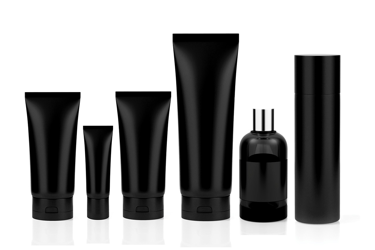
Beauty formulas can be sensitive to air, light, temperature, contamination or repeated hand contact. A vitamin C serum, for example, may require stronger light and oxygen protection than a powder product. A balm, cream or mascara has different hygiene and dispensing demands from a shampoo or body wash. These requirements influence whether the pack uses a tube, pump, airless system, jar, stick, dropper, sachet, carton or refill component.
That is why material choice should not be reduced to one sustainability claim. McKinsey’s 2025 packaging sustainability analysis noted that no one packaging substrate is superior across every sustainability dimension. In beauty, the point is very practical: glass may feel premium and be recyclable in many systems, but it is heavier and more fragile; plastic can be light and functional, but recyclability depends on material type, color, labels, closures and local collection systems; paper can reduce plastic use, but it still has to protect the product and survive real handling.
Dispensing is part of brand trust
A good dispenser tells the user how much product to apply and helps reduce mess. Pumps, droppers, twist sticks, spatulas, fine-mist sprayers and squeeze tubes each create a different ritual. If the dispenser wastes product, clogs, leaks in transit or makes the pack hard to empty, visual appeal will not compensate for the poor experience.
For smaller beauty brands, a useful rule is to prototype the opening, closing, dosing and final 10 percent of use before approving artwork. A pack that looks elegant in a rendering may not perform well with wet hands, in travel bags, in shower storage or after repeated use.
Build visual impact for shelf and screen
Beauty packaging still needs instant recognition, but recognition now happens in more places. A pack must read on a retail shelf, in a thumbnail image, on a product detail page, in an influencer video and inside a shipping box. The visual system should separate brand assets from product information and make both legible at different sizes.
Information hierarchy should be designed, not squeezed in
The front panel should make the product type, variant and key differentiator clear without overcrowding. A skincare customer may need to identify texture, skin concern, active ingredient or SPF status quickly. A makeup customer may prioritize shade, finish and format. A fragrance customer may respond more to mood, collection architecture and bottle silhouette.
Common mistakes include setting the product name in attractive but low-contrast type, using too many claims on the front panel, or hiding the shade or product function on a secondary face. A more durable approach is to define the hierarchy early: brand name, product category, variant or shade, one supportable benefit, and required quantity or regulatory information where applicable.
Tactility needs a reason
Embossing, soft-touch coatings, metalized finishes, textured papers and sculptural closures can help a beauty product feel more premium. They can also add cost, complicate recycling or reduce scuff resistance. The design question is not whether a finish is fashionable, but whether it supports the product story and survives the supply chain.
A minimalist clinical serum may benefit from matte white space and clear typography. A color cosmetics launch may need stronger shade cues and more expressive graphics. A refillable fragrance bottle may justify a heavier keepsake component, while a daily cleanser may need a more practical format. Visual choices should be tied to use, price point and channel rather than copied from trend boards.
Design for compliance space early
Beauty packaging carries more than branding. It also has to provide room for legally required and commercially necessary information. In the United States, FDA cosmetics labeling guidance says the principal display panel must identify the product and include an accurate net quantity statement, while required label statements must be prominent, conspicuous and in English where applicable. ISO 22715 also addresses cosmetics packaging and labeling requirements in relation to national rules and practices.
Design teams should treat compliance information as part of the architecture, not as a late-stage addition. If the package is too small for ingredients, warnings, directions, distributor information, batch codes, symbols, barcodes and multilingual requirements, the brand may need an outer carton, leaflet, peel-back label or digital support. That decision affects cost, sustainability and customer clarity.
| Design area | What to check before artwork approval | Why it matters |
|---|---|---|
| Principal display panel | Product identity, net quantity, variant and clear product function | Customers and regulators need core information to be easy to notice |
| Ingredient and safety information | Legibility, contrast, language requirements and placement | Small type or poor contrast can create compliance and trust issues |
| Claims | Evidence for terms such as recyclable, refillable, clean, biodegradable or dermatologically tested | Unsupported claims increase greenwashing and advertising risk |
| Codes and traceability | Barcode area, batch code, date code and potential 2D code placement | Retail, ecommerce and supply chain systems need reliable scanning and tracking |
Sustainability is a design system, not a slogan
Sustainability has become a baseline expectation in beauty packaging, but vague claims are more risky than persuasive. The U.S. Federal Trade Commission’s Green Guides advise marketers to avoid broad, unqualified environmental claims such as general “green” or “eco-friendly” statements unless they can be properly substantiated. The same principle should guide packaging design: be specific, measurable and clear about whether the claim applies to the product, the primary pack, the secondary carton or only one component.
The European regulatory environment is also becoming more specific. The European Commission said Regulation (EU) 2025/40 on packaging and packaging waste entered into force in February 2025 and began applying on a phased basis from August 12, 2026. The Commission has also pointed to a harmonized packaging labeling system from 2028 and broader recyclability and recycled-content requirements from 2030. Beauty brands selling into the EU should avoid designing packs that look sustainable but are difficult to sort, recycle or substantiate.
Refill and reuse need behavior design
Refillable beauty packaging can reduce waste in some contexts, but it only works when the user actually buys and uses refills. Mintel’s 2026 beauty packaging analysis reported a gap between consumers who bought refill packs in 2024 and those who bought refillable products, with convenience identified as a major barrier. In other words, refill design is not only a component decision; it is a behavior design problem.
A credible refill system should make the refill cheaper or otherwise clearly worthwhile, easy to find, clean to use and visually compatible with the original pack. If the refill is hard to open, messy to transfer, not stocked consistently or made from materials that create new disposal problems, the sustainability story becomes weaker. See also: BEAUTY INGREDIENTS.
Recyclability depends on real-world details
Many beauty packs are small, multi-material or decorated with pumps, mirrors, magnets, labels, elastomers and metallized effects. These features may improve usability or premium feel, but they can complicate sorting and recycling. A design-for-recycling review should look at the whole pack: base material, closure, label adhesive, colorant, sleeve coverage, decoration method and whether components can be separated by the user or the recycling system.
The practical design direction is clear: reduce unnecessary components, avoid mixed materials unless there is a strong functional reason, test decoration compatibility, and make disposal instructions specific. “Recyclable where facilities exist” is not the same as proving that a pack is likely to be recycled in the markets where it is sold.
Plan for smarter packaging and denser information
Beauty packaging has limited physical space, while customers increasingly expect more information: ingredient explanations, shade matching, usage instructions, proof of claims, recycling guidance, authenticity checks and tutorials. Digital access points are becoming more important for that reason.
GS1’s Sunrise 2027 initiative sets an industry goal for retail point-of-sale systems to read and process 2D barcodes by the end of 2027. For packaging designers, this does not mean every beauty pack should be covered in codes. It means code placement, contrast, quiet zone, print quality and customer experience should be planned earlier. A 2D code can connect a small carton or bottle to richer information, but it still has to scan reliably and not fight the visual hierarchy.
Smart packaging should not become a dumping ground for unclear claims. If a QR or 2D code leads to recycling instructions, ingredient education or authentication, the landing experience should be updated, mobile-friendly and consistent with the physical label.
A practical framework for beauty product packaging design
A useful packaging brief should bring brand, formula, operations, compliance and sustainability into one decision process. The following framework helps separate essential design decisions from decorative preferences.
| Question | Design implication | Common risk |
|---|---|---|
| What is the product format and formula sensitivity? | Choose a structure that protects stability, hygiene and dosing | Approving a beautiful pack that does not suit the formula |
| Where will the product be discovered? | Design for shelf, ecommerce thumbnails, video and unboxing | Creating packaging that looks good only in studio renders |
| What must be readable at first glance? | Define a front-panel hierarchy before illustration or finish | Overloading the pack with claims and decorative text |
| Which claims can be supported? | Use specific, qualified sustainability and performance language | Using vague terms that sound appealing but lack evidence |
| How will the pack be disposed of or refilled? | Consider recyclability, refill access and consumer instructions | Designing a sustainability feature that users will not adopt |
| What information may move to digital? | Reserve space for 2D codes and connect them to useful content | Adding codes late and damaging visual balance or scan quality |
The strongest product packaging design decisions are often not the most visible ones at first glance. They show up when the carton fits the line, the bottle does not leak, the claim is easy to substantiate, the refill is simple, the barcode scans, and the customer understands what the product is and how to use it.
Key dates affecting packaging decisions
Beauty packaging projects often take months to move from brief to production, so upcoming requirements should be considered before tooling, molds or large artwork runs are approved.
- February 2025: The EU Packaging and Packaging Waste Regulation entered into force, according to the European Commission.
- August 12, 2026: The regulation began applying on a phased basis, making this a key review point for brands selling into the EU.
- 2028: The European Commission has identified harmonized packaging labeling as part of the EU packaging rule rollout.
- End of 2027: GS1’s Sunrise 2027 initiative aims for retail point-of-sale readiness for 2D barcodes.
- 2030: EU packaging rules point toward broader recyclability and recycled-content requirements, especially relevant for plastic packaging.
The editorial takeaway is not that every brand should redesign everything immediately. A safer conclusion is that beauty packaging briefs should now include regulatory horizon scanning, recycling compatibility and digital information planning at the concept stage.
Frequently asked questions
What makes product packaging design effective for beauty products?
Effective beauty packaging combines formula protection, usability, visual recognition, accurate information and credible claims. It should help the customer understand the product quickly, use it comfortably and trust what the brand says about performance or sustainability.
How can small beauty brands improve packaging without increasing complexity?
Small brands can focus on clearer hierarchy, better contrast, fewer unsupported claims, improved dispensing and simpler material choices. These changes often improve perception without adding expensive finishes or complicated structures.
Is refillable packaging always more sustainable?
No. Refillable packaging depends on refill adoption, material reduction, logistics, cleaning behavior and the design of the refill itself. If customers do not use refills or if the refill creates hard-to-recycle waste, the benefit may be limited.
Should beauty brands add QR codes or 2D barcodes to packaging?
They should consider them when the code has a clear purpose, such as authentication, recycling guidance, usage instructions or access to expanded product information. The code must be planned into the artwork so it scans reliably and does not clutter the design.
What is the biggest packaging design mistake in beauty?
The biggest mistake is treating packaging as decoration after the product is finished. Better results come from designing the structure, claims, labeling, sustainability route and visual system together from the beginning.