Cardboard box packaging design for beauty products in a stricter packaging market
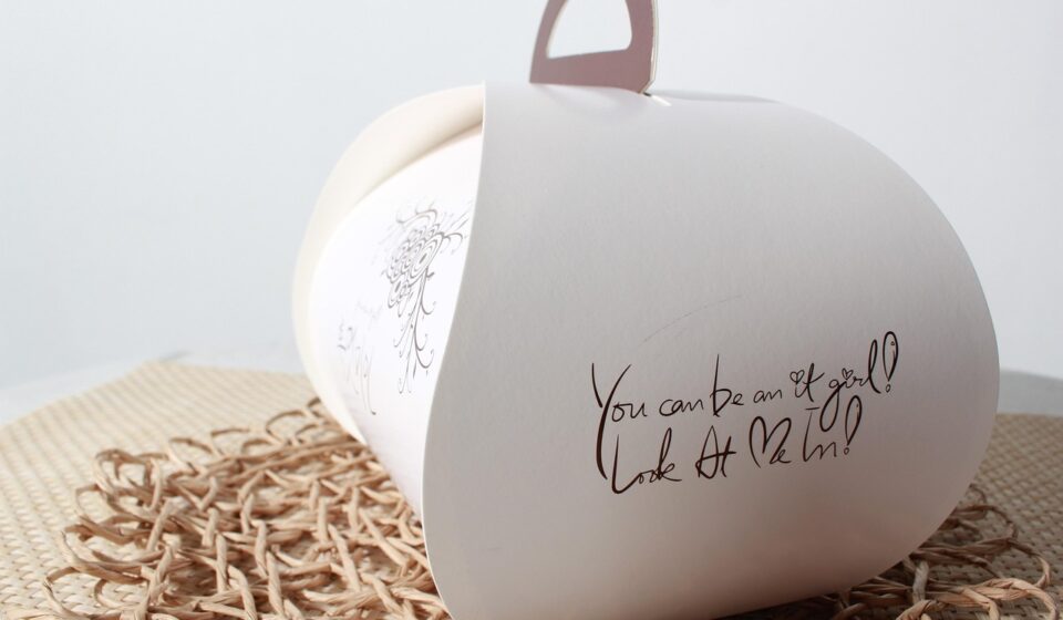
What cardboard box packaging design needs to accomplish now
Cardboard box packaging design for beauty products should start with structure, not decoration. The box has to protect fragile jars, palettes, tubes or refill packs; present mandatory information clearly; create a premium first impression; and avoid unnecessary board, inserts or empty space. In 2026, the strongest approach is to treat the box as a packaging system. Product fit, retail display, shipping route, recycling claim and print finish all need to work together.
That matters because packaging rules and environmental claim scrutiny are becoming more concrete in major markets, while beauty buyers still expect packaging that feels tactile, giftable and carefully made. The practical goal is not simply the thinnest or plainest carton. It is a well-sized, well-documented cardboard box that looks intentional and can be justified. (commission.europa.eu)

For more packaging ideas across beauty and consumer products, explore the Packaging Design section.
For beauty products, cardboard is most often used as a folding carton, sleeve, rigid set box, corrugated mailer or shipper around inner packs. Each format has a different job. A lipstick sleeve may focus on brand blocking and shade identification. A glass serum carton must control movement and reduce abrasion. An e-commerce mailer has to withstand compression, scuffing and return logistics. Treating all of these as the same design problem often leads to oversized boxes, weak panels, unclear recycling messages or decorative finishes that do not support the product.
Start with the box format before artwork
The first design decision is the packaging format. Graphics can make a box memorable, but the format determines whether the product is protected, efficient to pack and easy for a customer to open. A dieline should be selected only after the product dimensions, weight, fragility, sales channel and filling process are clear.
| Format | Typical beauty use | Design priority | Common risk |
|---|---|---|---|
| Folding carton | Skincare jars, fragrance, makeup, haircare minis | Clean panels, accurate fit, efficient print production | Too much empty space or weak locking tabs |
| Paperboard sleeve | Soap, compact sets, refill pouches, secondary branding | Minimal material and strong shelf identity | Limited protection if used as the only pack |
| Corrugated mailer | Direct-to-consumer kits and subscription beauty boxes | Transit protection and unboxing sequence | Oversized shipping dimensions and loose movement inside |
| Rigid paperboard box | Premium gift sets, fragrance sets, holiday collections | Perceived value and presentation | Higher material use and mixed-material decoration |
A useful structure brief should include the product’s exact dimensions, filled weight, primary container material, cap or pump height, leak risk, temperature sensitivity, expected sales channel and whether the box must stand upright, hang, stack or ship alone. For e-commerce, the outer carton may need different priorities from a retail carton because it will face conveyor handling, compression and customer opening without the benefit of a controlled shelf display.
Design around protection, information and user experience
Fit and protection
Beauty packaging often has a high ratio of perceived value to product size, so designers may be tempted to add air, platforms or nested inserts. A better method is to map the product’s vulnerable points first. Glass corners, pump stems, mirrored compacts, pressed powders and thin aluminium tubes all fail in different ways. If an insert is needed, it should protect the vulnerable point rather than simply lift the product for display.
Cardboard dividers, folded paperboard cradles and molded fibre trays can sometimes replace plastic inserts, but the replacement should be tested rather than assumed. A paper-based insert that crushes too easily, sheds fibre on a cosmetic component or slows packing may create more problems than it solves. The design should move from prototype to sample testing before final artwork is locked.
Clear information panels
A beauty box also needs space for information that may be less visually prominent than graphics but is commercially important: product name, shade or variant, net content, ingredient list, use directions, warnings, company details, barcode, batch or lot coding area and market-specific symbols. The exact legal requirements depend on where the product is sold, so regulatory copy should not be treated as a last-minute layout item.
Good cardboard box packaging design gives this information a clear hierarchy. The front panel can carry the brand, product type and key choice cues. A side panel can support variant colour or shade navigation. The back panel can hold longer copy and required details. Coding areas should avoid dark backgrounds, heavy varnish and folds that make inkjet or laser codes hard to read.
Unboxing without excess
Premium unboxing does not require a complicated box. Beauty buyers respond to a simple sequence: opening tab, reveal, product orientation, texture and a clear signal that the product is new and intact. That can be created with a clean tuck, a controlled reveal window, a printed interior panel or a simple paper wrap. Extra magnets, plastic windows, foam blocks and decorative fillers should be questioned because they add weight, cost and sorting complexity.
Make sustainability claims specific and verifiable
Cardboard has a strong recycling story, but that does not make every cardboard box automatically sustainable in every market. The American Forest & Paper Association reported that the U.S. cardboard recycling rate was 69% to 74% in 2024. That is useful context for fibre packaging, but it should not be stretched into a broad claim that a specific box is environmentally superior without supporting evidence. (afandpa.org)
In the United States, FTC guidance says environmental marketing claims should be supported by competent and reliable evidence. The FTC’s Green Guides summary also says recyclable claims should be qualified when recycling facilities are not available to at least 60% of the consumers or communities where a product is sold. For beauty packaging, this means claims such as recyclable, made with recycled content or plastic-free should be specific, substantiated and tied to the actual package component being discussed. (ftc.gov)
In the EU, Regulation (EU) 2025/40 on packaging and packaging waste began applying on 12 August 2026, according to the European Commission. The regulation includes packaging minimisation requirements and, from 2030, recyclability assessment based on design-for-recycling criteria. For cardboard beauty boxes sold into the EU, the direction is clear: avoid unnecessary volume, reduce avoidable layers and keep documentation that explains why the selected weight and format are necessary for function. (commission.europa.eu)
California’s SB 54 is another signal for brands selling into large U.S. markets. CalRecycle describes the law as a producer responsibility framework for single-use packaging and plastic food service ware, with 2032 milestones for recyclability or compostability and other program requirements. Even where a cardboard carton is not the most difficult material in the system, the broader message is that packaging design decisions increasingly affect reporting, fees and end-of-life expectations. (calrecycle.ca.gov) See also: BEAUTY INGREDIENTS.
Practical claim discipline starts at the component level. Instead of saying a beauty kit is eco-friendly, identify what can actually be verified: the carton uses a stated percentage of recycled paperboard, the box is designed without a plastic window, the sleeve avoids lamination, or the insert is paper-based. If a finish, coating or adhesive may affect recyclability in a target market, confirm it with the board supplier, printer or recycling guidance before making a consumer-facing claim.
Use visual design to signal value without adding waste
Cardboard gives beauty brands a broad design range: soft-touch appearance, textured stock, embossing, debossing, foil-like effects, spot gloss, high-contrast typography and interior printing. The challenge is to create value cues without turning a simple fibre package into a mixed-material object that is difficult to sort or recycle.
One practical approach is to make the board itself part of the visual language. A natural white, cream or kraft-toned stock can support skincare, wellness or refill positioning. A smooth coated board may work better for colour cosmetics that require precise shade communication. A darker board can look premium, but it may reduce barcode contrast, make small ingredient copy harder to read and require more ink coverage. These are design trade-offs, not purely aesthetic choices.
Typography should be planned for both shelf distance and close reading. Beauty boxes often compete in small spaces, so the product type and key differentiator should be readable quickly. At the same time, tiny low-contrast copy can weaken trust, especially for skincare products where buyers read ingredients and use instructions carefully. A disciplined grid helps the front panel stay elegant while the side and back panels remain useful.
Finishes should have a reason. Embossing can guide the hand to a logo or seal. A small gloss contrast can highlight a product benefit or shade name. Interior printing can create a gift-like moment without adding an insert. Decorative layers that mainly increase perceived volume are increasingly hard to defend in markets moving toward packaging minimisation. This is especially relevant for beauty gift sets, where large boxes can create strong visual impact but also invite criticism if the product-to-package ratio feels misleading.
A production-ready checklist for cardboard beauty boxes
A beautiful rendering is not a production-ready package. Before approval, the design file should be checked against manufacturing, filling, logistics and claim evidence. The following checklist can reduce late-stage changes.
- Confirm the sales channel. Retail shelf, marketplace shipping, salon distribution and gift sets create different structural needs.
- Measure the product in its final state. Include cap, pump, label thickness, seals, fill weight and any protective wrap.
- Choose the board and flute for the job. Folding carton board, micro-flute corrugated and rigid board solve different problems.
- Right-size the dieline. Remove unnecessary height, width and false depth while preserving protection and packing speed.
- Reserve compliance areas early. Do not place required copy, barcodes or batch codes on folds, seams, dark varnish or unstable surfaces.
- Check opening and reclosure. A tab that tears, a sleeve that sticks or a mailer that looks damaged after first opening weakens the experience.
- Prototype with real products. Test filled weight, assembly time, shelf stance, scuffing, compression and opening sequence.
- Document environmental claims. Keep supplier statements for recycled content, paper certification, coatings, inks and any recyclability claim.
- Review end-of-life instructions by market. Recycling language may need to be qualified or localized rather than copied globally.
The strongest cardboard box packaging design is usually the one where the creative idea and the engineering logic support each other. If the brand story is clean beauty, the structure should avoid wasteful theatrics. If the product is a fragile premium serum, the box should communicate care while genuinely controlling movement. If the sales model is e-commerce, the unboxing moment should not depend on a retail carton that was never designed for shipping.
Frequently asked questions
Is cardboard a good material for beauty packaging?
Cardboard can be a strong choice for many beauty products because it is printable, widely understood by consumers and often compatible with paper recycling systems. It still needs the right board grade, structure and finish. Fragile glass, pumps, liquids and pressed powders may require inserts, dividers or an outer shipper.
What is the difference between a folding carton and a corrugated mailer?
A folding carton is usually the printed retail box directly around the product or primary container. A corrugated mailer is a stronger shipping box designed for transit. Some direct-to-consumer beauty brands use both: a retail carton for presentation and a corrugated mailer for delivery protection.
Can a premium beauty box still be recyclable?
It can be, but recyclability depends on the full construction. Heavy lamination, plastic windows, magnets, foam, mixed inserts and certain coatings can complicate recycling. A premium look can often be achieved with board texture, restrained ink, embossing, debossing or thoughtful opening design instead of extra materials.
How should recycled content be shown on a cardboard box?
Use specific, substantiated wording. If a carton contains recycled paperboard, the percentage and whether it is post-consumer or pre-consumer content should be confirmed with the supplier before printing. Avoid broad claims that imply the whole product or every packaging component has the same attribute.
What should be checked before approving the final artwork?
Check dieline accuracy, copy hierarchy, barcode readability, colour contrast, batch-code area, bleed and safe zones, folding direction, varnish placement, regulatory text, recycling wording and proof of any environmental claims. A physical sample with the real product inside is more useful than a flat artwork review alone.