Salt packaging design for moisture control and shelf appeal
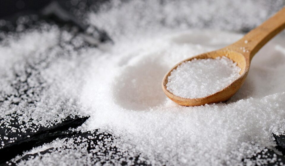
Salt packaging design starts with protection, not decoration
Salt packaging design has to do more than create a clean shelf presence. Salt is chemically stable, but the customer experience can still fail if moisture gets into the pack, crystals cake, closures clog, labels overstate what the product does, or disposal claims are unclear. A useful design brief starts with three questions: how the salt behaves in storage, how the customer will open and use it, and what the package can truthfully claim. The same logic applies to everyday table salt, premium sea salt, finishing salt, Epsom-style bath salts, and mineral blends for beauty routines. For more packaging thinking across categories, see our packaging design section.
The best salt packs often look simple, but that simplicity is engineered. Barrier performance, closure design, typography, regulatory wording, and material recovery all influence whether the finished pack feels useful, trustworthy, and current.
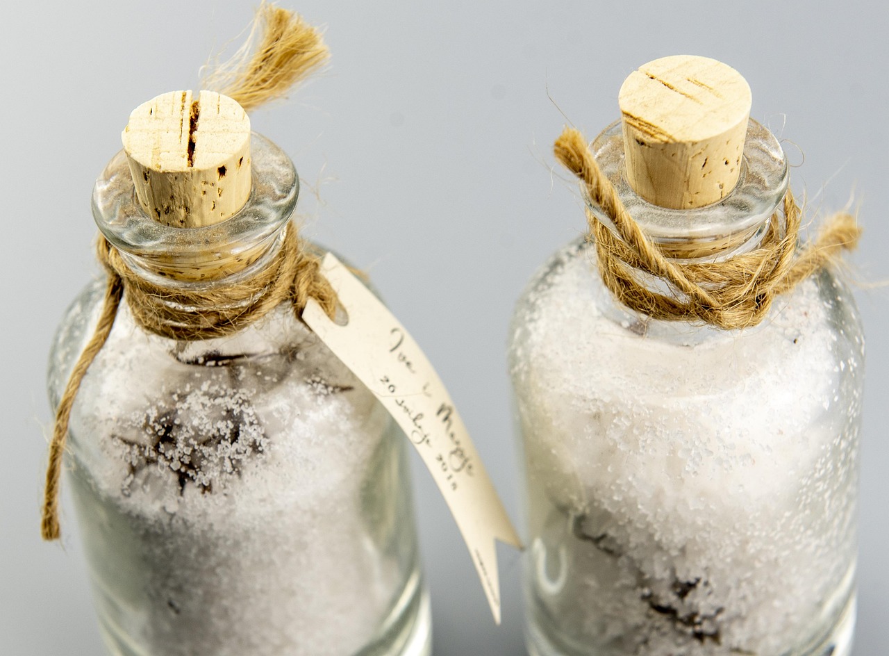
Why moisture control is the core design problem
Salt can look like an easy product to package because it does not spoil like fresh food. The more common problem is texture. Food-grade salt storage guidance often points to moisture movement as a major cause of caking. Technical storage guidance from Cargill notes that when relative humidity around salt rises above about 75%, salt can absorb moisture. When humidity later drops, water can leave the salt, and recrystallized salt may bridge particles together. The result is clumping, poor pouring, dusty residue, and a customer perception that the pack is old or poorly made.
That makes the package structure as important as the surface graphics. A paper carton may look natural, but it may need an inner liner or coating for humid supply chains. A pouch may reduce material use, but its zipper must tolerate salt dust and repeated handling. A jar may be convenient, but a shaker fitment needs to limit moisture entry through the perforations after first use.
Design implications for edible salt
For table salt, sea salt, kosher-style salt, and seasoning salt, the package has to protect flowability and prevent contamination. If the product is sold as iodized, non-iodized, additive-free, or made with an anti-caking agent, the label should match the actual formulation and local labeling rules. Codex food additive provisions for food-grade salt include several anti-caking options, such as calcium silicate, magnesium carbonate, silicon dioxide, and certain ferrocyanides within defined limits. That does not mean every market or every product can use the same wording. It means packaging designers should get confirmed copy from formulation and regulatory teams before final artwork.
Design implications for bath salt and beauty salt
Bath salts and mineral soak products face a similar moisture challenge, but the consumer promise is different. These products may include fragrance, botanicals, colorants, essential oils, or cosmetic positioning. A beauty-oriented salt pack should avoid food cues unless the product is genuinely edible, and it should not imply medical treatment unless those claims are supported and legally permitted. In beauty retail, tactile finishes, soft colors, refill pouches, and apothecary-style labels can work well, but the inner barrier still has to protect crystals from damp bathroom environments.
Choose the package format by use case
No single salt packaging format is right for every product. A premium glass jar can suit finishing salt, while a lightweight pouch may be better for a refill or bath soak. The decision depends on unit size, price point, retail channel, humidity exposure, filling equipment, and the expected moment of use.
| Format | Good fit | Design advantage | Watchouts |
|---|---|---|---|
| Paperboard carton with inner liner | Everyday table salt and dry retail packs | Flat panels support clear typography and efficient stacking | Needs moisture protection and strong seams in humid distribution |
| Flexible stand-up pouch | Refills, specialty salts, bath salts, larger value packs | Lightweight, printable, shelf-efficient, and easy to ship | Zippers can clog with fine crystals; multi-material laminates may limit recyclability |
| Rigid plastic jar or shaker | Kitchen use, seasoning blends, controlled dispensing | Convenient closure and visible product levels | Shaker holes can admit moisture; recyclable claims depend on local systems |
| Glass jar | Premium finishing salt, gift sets, spa-style beauty products | High perceived value and strong product visibility | Heavier shipping weight and breakage risk |
| Metal tin | Giftable salts, travel tins, heritage designs | Durable, distinctive, and reusable in some contexts | Requires attention to lining, corrosion risk, and fitment seal |
| Bulk bag or refill sachet | Household refill, hospitality, salon, spa, and back-bar use | Reduces secondary decoration and can lower pack weight per gram | Needs clear refill instructions and a compatible primary container |
Industry packaging reports from groups such as Euromonitor and BCG continue to point to two broad movements across fast-moving consumer goods: flexible packaging remains attractive for cost and convenience, while paper-based formats are gaining attention where barrier requirements can be solved responsibly. For salt, this does not mean paper automatically replaces plastic. It means the design team should test whether the structure protects flowability, survives the route to market, and can be described honestly at end of life.
Make the front panel useful in three seconds
Salt is a familiar product, so shoppers often decide quickly. The front panel should answer the practical questions first: what type of salt is this, what is it for, how much is inside, and what makes it different from the neighboring pack?
- Product identity: Use clear terms such as table salt, sea salt, kosher-style salt, finishing salt, bath salt, mineral soak, or refill pouch. Avoid poetic names that hide the use case.
- Grain size: Fine, coarse, flakes, crystals, and granules behave differently in cooking, pouring, bathing, and exfoliating contexts. Grain size is often more useful than a decorative origin story.
- Function: For food, mention everyday cooking, finishing, pickling, or grinder refill only when accurate. For beauty, distinguish soaking, scrub blending, or aromatherapy-style bathing without making unsupported therapeutic claims.
- Ingredient and additive clarity: If the product contains iodine, anti-caking agents, fragrance, colorants, oils, or botanicals, the pack should make that information easy to find.
- Dispensing cue: Shaker, scoop, pour spout, wide-mouth jar, refill pack, or resealable pouch should be clear from the structure or supporting copy.
Designers can use hierarchy to separate essential facts from brand atmosphere. A clean front panel might place product type and grain size in the main reading zone, while origin, story, certifications, and preparation notes move to side or back panels. This keeps the pack premium without forcing shoppers to decode it.
Sustainability claims need proof, not just natural colors
Muted kraft paper, leaf icons, pale green palettes, and minimalist typography can suggest environmental responsibility, but visual style is not evidence. In the United States, the Federal Trade Commission Green Guides have long warned marketers to qualify recyclable claims when recycling facilities are not available to a substantial majority of consumers or communities where the product is sold. California has also restricted use of the chasing arrows and similar recyclability indicators under SB 343, with restrictions tied to products and packaging manufactured after October 4, 2026, while related litigation and implementation questions should be checked before artwork is finalized.
For brands selling into Europe, the Packaging and Packaging Waste Regulation, Regulation (EU) 2025/40, sets a stronger direction toward recyclability, recycled content, packaging minimization, and clearer disposal information over the coming years. The design takeaway is practical: do not place a broad recyclable, compostable, plastic-free, biodegradable, or eco-friendly claim on a salt pack unless the team has market-specific evidence and a documented claim review.
Salt packaging also shows why sustainability decisions need to be assessed as systems. A mono-material pouch may improve recycling compatibility, but it still needs enough moisture barrier. A paper pack may look renewable, yet require coatings that complicate recovery. A reusable glass jar may feel premium, but shipping weight and actual refill behavior matter. A refill pouch can reduce material per use only if customers refill the durable container instead of treating both items as single-use packaging.
Design details that improve everyday use
Good salt packaging earns repeat trust through small interactions. A pack that leaks crystals into a drawer or cakes after two weeks will not feel premium for long, even if the graphics are strong. See also: BEAUTY INGREDIENTS.
Closures and dispensing
Closures should match the grain. Fine table salt needs controlled dispensing and moisture protection. Coarse sea salt may need a wider pour spout or spoonable mouth. Flake salt needs a pack that prevents crushing. Bath salts often need a wide opening for scoops and wet hands, plus a closure that can be resealed securely in a bathroom.
Legibility and contrast
Salt products are often white, beige, pink, gray, or translucent, so packaging can easily become low contrast. Use typography that remains readable under store lighting and in kitchen or bathroom settings. Premium does not have to mean tiny type. Key information such as net weight, ingredient list location, grain type, fragrance name, and warnings should not disappear into a decorative layout.
Texture and tactility
For premium edible salts and beauty salts, tactile design can communicate quality without adding unnecessary components. Matte varnish, embossed paper labels, ribbed caps, soft-touch pouches, and restrained spot gloss can all help. However, finishes should not interfere with recyclability, ink adhesion, barcode scanning, or regulatory readability.
Color coding
Color systems help when a brand offers multiple salts. For example, blue can identify sea salt, charcoal gray can identify smoked salt, rose can identify Himalayan-style pink salt, and lavender can identify a calming bath soak. The system should remain accessible for users with limited color perception, so pair color with text, icons, or pattern cues.
A practical brief for salt packaging design
A strong creative brief prevents the design process from becoming only a mood board. Before concept development, answer the following questions:
- Is the product for food, cosmetic, household, spa, or industrial use?
- What grain size, moisture sensitivity, and flow behavior must the package protect?
- Will the pack be stored in a pantry, bathroom, restaurant kitchen, salon, warehouse, or e-commerce parcel?
- Does the product need a shaker, spout, scoop, zipper, tamper evidence, induction seal, or child-resistant feature?
- What claims are confirmed: iodized, non-iodized, additive-free, fragrance-free, refill, recyclable, recycled content, compostable, or responsibly sourced?
- Which markets will receive the pack, and who signs off on food-contact, cosmetic, disposal, and claim language?
- How will the package look in a set: single SKU, flavor range, bath collection, refill system, or giftable bundle?
The most resilient salt packaging design balances shelf appeal with restraint. It does not hide basic product facts, overstate sustainability, or choose materials only because they are fashionable. It matches structure to the product and channel. Above all, it protects the tactile experience that salt customers notice immediately: free-flowing crystals, clean dispensing, and a package that still looks intentional after repeated use.
Frequently asked questions
What is the most important feature in salt packaging design?
Moisture control is usually the first priority because moisture movement can lead to caking, poor pouring, and a lower-quality user experience. After that, closure design, label clarity, and truthful claims become the main differentiators.
Is paper packaging a good choice for salt?
Paper can work for salt when the total structure provides enough moisture resistance and physical strength. A simple paper look is not enough by itself. Designers should verify coatings, liners, seams, and end-of-life claims before presenting paper as a sustainable solution.
How should bath salt packaging differ from food salt packaging?
Bath salt packaging can use more beauty-led cues such as fragrance naming, spa colors, tactile labels, and giftable structures. However, it should avoid edible cues if the product is not food, and it still needs moisture protection for bathroom storage.
Can a salt package claim to be recyclable?
Only if the claim is supported in the markets where the product is sold. Recyclability depends on material structure, inks, labels, closures, local collection, sorting, and processing. Broad claims should be reviewed carefully before artwork approval.
What makes premium salt packaging feel credible?
Credibility comes from clear product identity, visible grain or honest texture cues, strong closure performance, restrained claims, and details that support the product’s actual use. Premium design should make the salt easier to understand and use, not just more decorative.