What Makes Beauty Packaging Design Sell Faster in a Crowded Market?

Why Does Packaging Design Matter So Much for Beauty Brands?
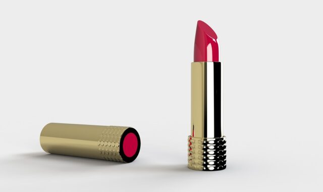
Packaging design is often the first contact a buyer has with a beauty product. On a shelf or online listing, they cannot fully judge texture, scent, shade, or skin feel yet. A serum bottle, lipstick carton, or body lotion tube needs to explain the product fast, show the right quality level, and make the price feel reasonable. For more beauty product ideas and brand presentation topics, you can also visit weidushu.com.
Clear Shelf Recognition
In a busy beauty aisle, the pack only gets a few seconds. Simple color blocking, a steady logo position, and a clear product name help shoppers spot the item and remember it next time. Ipsos reported in 2018, in a U.S. online survey of 2,002 adults for the Paper and Packaging Board, that 72% said product package design often influenced purchase decisions, while 67% said materials did. That survey is not new, so I would treat it as a useful reference, not a current 2026 figure. Even so, it backs up what most brand owners already see in retail: the outside of the pack still carries weight.
Faster Online Decisions
On Amazon, TikTok Shop, brand websites, or retailer pages, the pack has to work as a small image. Fine foil lines can look good in hand, but they may disappear on a phone screen. A practical beauty pack keeps the main benefit, product type, and shade or variant clear at thumbnail size. If the item is a vitamin C serum, the shopper should not have to zoom in three times just to understand that.
Higher Perceived Product Value
Beauty buyers read value from small details. Cap weight, label alignment, pump movement, glass thickness, carton finish, and even the sound of a closure all say something about price. A $28 moisturizer in a weak jar can feel lower-end than the formula really is. A $12 hand cream with tidy typography and a soft-touch tube can feel good enough for gifting. These small cues often do more work than a long claim on the front panel.
What Should a Beauty Package Say in the First Three Seconds?
The first message should be clear before it tries to be clever. Beauty shoppers may enjoy mood and story, but they still need to know what the item is, who it is for, and why it belongs in their bathroom cabinet. Keep the front panel easy to read, then use the side panel for the longer details.
Product Type and Benefit
Put the product category where buyers expect to find it: cleanser, toner, serum, cream, balm, shampoo, conditioner, or fragrance. Then add one main benefit instead of loading the front with five claims. For example, Brightening Vitamin C Serum is easier to understand than Advanced Radiance Renewal Complex. Brand language has its place, but the front panel should do the job of a helpful store assistant.
Brand Mood and Price Tier
Color, spacing, type style, and finish tell shoppers whether the product feels clinical, playful, natural, luxury, teen-friendly, or spa-like. A dermatologist-inspired skin care line may use white space, blue accents, and clean sans serif type. A bath product for gifting may use warmer colors, texture, and illustration. One route is not always better than the other. The right choice is the one your target buyer understands without working too hard.
Proof Points Buyers Can Check
Claims should be short, clear, and able to stand up to a basic check. If you say refillable, the refill needs to be easy to find. If you say recyclable, the material and local market rules matter. If you say fragrance-free, the formula and label rules should be checked before artwork is approved. McKinsey’s 2023 sustainability packaging research found that price and quality still rank as top purchase factors, even as sustainability matters more in many markets. So proof points should reduce buyer doubt, not turn the pack into a crowded notice board.
How Do Materials Shape Trust and Cost?
Materials are not only a production decision. They affect touch, freight cost, leakage risk, storage, retail display, and how shoppers judge the brand. A sensible material plan starts with formula needs, sales channel, target price, and the story the product needs to tell.
Glass for Premium Skin Care
Glass often gives skin care a clean and high-value feel. It works well for oils, fragrance, ampoules, and higher-end creams, and it usually photographs well. The trade-off is weight, breakage risk, and higher freight cost. For cross-border beauty brands, that added weight can quickly cut into margin. If you choose glass, test the carton, inner tray, and drop protection early, not after the photoshoot is finished.
Tubes and Airless Pumps for Daily Use
Tubes are practical for cleansers, hand creams, sunscreen, and hair masks. Airless pumps suit formulas that need cleaner dispensing and less air exposure. Buyers also care about control during daily use. Nobody wants to fight with a stiff pump before morning coffee. A package that gives the right dose feels more considered and helps reduce product waste.
Paperboard for Story and Protection
Paperboard cartons give the brand space for ingredients, directions, brand story, barcode, certifications, and multilingual copy. They also help protect the primary packaging during shipping and store handling. The hard part is knowing when to stop. Too much copy can make the carton look busy and unsure. Keep the front for product choice, the sides for useful detail, and the back for compliance and directions.
How Can Sustainable Packaging Feel Premium?
Sustainable packaging can still look polished, but beauty brands need to avoid lazy green signals. Kraft paper, leaf icons, and beige ink do not prove much by themselves. Buyers are more used to checking claims now, and regulators are also watching environmental wording more closely. Premium packaging now has to feel honest, not just clean in the mockup.
Quiet Sustainability Cues
NIQ’s 2023 Sustainable Beauty analysis reported that 62% of consumers said sustainability was more pivotal than two years earlier. Mintel reported in January 2026 that fragrance launches with ethical and environmental claims rose from 18% in 2019 to 41% in 2023. The direction is easy to see: sustainability claims are more common, so the design and the proof both need to be stronger. A low-ink carton, lighter bottle, mono-material cap, or refill pouch can say the right thing without shouting on the shelf.
Refill Systems That Stay Simple
Refills sound attractive in a meeting, but they fail if the user has to think too much or clean up a mess. Mintel noted in February 2026 that U.S. refillable beauty product launches grew only 7% from 2022 to 2024, showing that cost and convenience still slow the category down. If your brand offers refills, the refill should be cheaper, easy to pour or click in, and clear on shelf. A refill that spills on the sink usually does not get a second purchase.
Claims Backed by Real Rules
Claims such as recyclable, compostable, biodegradable, recycled content, and plastic-free need legal review. In the U.S., FDA cosmetic labeling guidance explains required label information such as identity and net quantity on the principal display panel. California SB 343 restricts recyclability symbols and claims when packaging does not meet state criteria. In the EU, Regulation 2025/40 on packaging and packaging waste pushes recyclability into formal design requirements. In practice, design and compliance should be discussed together from the start.
What Design Details Improve the User Experience?
Good beauty packaging works in real bathrooms, travel bags, and warehouse cartons. It opens cleanly, stands steady on a wet counter, does not leak in a makeup bag, and lets the buyer read the label without searching for better light. This sounds basic, but many packs that look costly still miss these points.
Easy Opening and Controlled Dispensing
A flip cap should open without breaking a nail. A dropper should pick up enough formula, and a jar seal should protect the cream without turning into a wrestling match. Controlled dispensing also matters for higher-cost formulas. If a pump gives twice the amount needed, the shopper feels waste every time they use it.
Readable Labels on Small Surfaces
Small bottles and lip products are hard to label well. Keep type size realistic, contrast clear, and line length short. Metallic ink on pale pink may look good in a mockup, then become hard to read in a bathroom. Always check a physical sample under warm light, cool light, and phone camera light before final approval.
E-Commerce Protection and Unboxing
E-commerce packaging has two jobs: protect the item and give the buyer a small good moment when the parcel opens. A dented carton makes even a strong formula feel second-rate. Use inserts, sleeves, seals, and shipper tests where they make sense. For premium orders, tissue paper or a printed thank-you card can help, but it should not create a pile of waste the customer feels bad about throwing away.
How Should You Prepare a Packaging Design Brief?
A clear brief saves money because it cuts down redesigns, wrong samples, and artwork delays. Before color palettes and mockups, the team needs decisions on buyer, channel, cost, compliance, and production. Beauty packaging becomes expensive when important answers arrive late.
Channel and Buyer Profile
Start with where the product will sell. A spa line, a mass retail cleanser, and a direct-to-consumer serum do not need the same pack. Write down the target buyer, price point, shelf set, competing brands, and hero claim. Add real use scenes such as gym bag, shower shelf, travel pouch, vanity table, salon backbar. These scenes help decide size, closure, and material better than mood words alone.
Compliance and Artwork Checklist
Build a simple checklist before final artwork starts. It should cover required label copy, net contents, ingredients, warnings, batch code space, barcode area, country-of-origin needs, recycling claims, and retailer rules. For U.S. cosmetic products, FDA guidance remains a key reference. For EU sales, responsible person details, ingredient labeling, nominal content, batch number, and precautions may need space on pack. Do not leave compliance checks to the final PDF.
Sample Testing Before Mass Production
Do not approve beauty packaging from screen renders only. Ask for material swatches, white samples, printed samples, filled samples, and shipping tests when the budget allows. A practical testing list includes:
- Drop test for glass bottles, jars, and cartons.
- Leak test for pumps, sprayers, droppers, and tubes.
- Rub test for labels, foil, varnish, and coating.
- Bathroom-use check with wet hands and low light.
- Thumbnail check for e-commerce images.
These tests are not exciting, but they catch problems before mass production. They also prevent the kind of packaging mistake that customers remember for the wrong reason.
FAQ
Q1: What Is the Most Important Part of Beauty Packaging Design? A: Clarity comes first. The buyer should quickly see the product type, main benefit, brand mood, and reason to trust the claim.
Q2: Is Sustainable Packaging Always More Expensive? A: Not always. Lightweighting, simpler cartons, fewer mixed materials, and better size planning can reduce cost. Refill systems, custom molds, and specialty materials may cost more.
Q3: Should a New Beauty Brand Choose Glass or Plastic? A: Choose based on formula, price, shipping channel, breakage risk, and brand position. Glass feels premium, while plastic, tubes, and airless pumps can be lighter and easier for daily use.
Q4: How Much Copy Should Go on the Front Panel? A: Keep the front panel focused on product name, category, main benefit, size, and one or two proof points. Put detailed directions and compliance copy on the side or back.
Q5: When Should Packaging Design Start in Product Development? A: Start before final formula launch planning. Container choice affects fill volume, stability testing, labeling space, shipping cost, retail display, and customer experience.