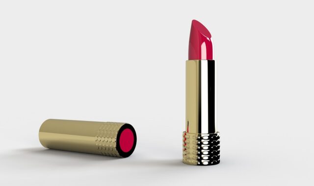
Packaging design logo guidelines for beauty products on shelf and online
Why the logo is only one part of beauty packaging design
A strong packaging design logo helps shoppers recognize a beauty product quickly, but it cannot carry the whole pack by itself. In cosmetics and skin care, the logo has to work alongside the product identity, shade or variant name, required label information, material choice, finish, and the way the pack appears in e-commerce thumbnails. The practical goal is not simply to make the logo bigger. It is to make the brand mark visible at the right moment while keeping the front panel clear, credible, and easy to scan.
This is especially important in beauty, where packaging often has to communicate both emotion and precision. A fragrance box may need atmosphere. A moisturizer may need trust. A color cosmetics line may need fast shade recognition. In each case, the logo should anchor the brand system while leaving enough room for shoppers to understand what the product is, why it matters, and how it differs from nearby alternatives.

For more packaging ideas across beauty and consumer product categories, visit the Packaging Design section.
Start with the role of the logo before choosing size or placement
Logo decisions often go wrong when the design starts with decoration instead of function. Before adjusting scale, color, or foil, define what the logo must do on this specific pack. A founder-led prestige brand may use the logo as the main trust signal. A clinical skin care brand may need the logo to support a more information-led label. A makeup range may need the logo to unify multiple shades without competing with color cues.
Three questions help clarify the logo’s role:
- Is the product bought by brand recognition or by function? A loyal customer may search for the brand mark first, while a new shopper may look first for SPF, cleanser, serum, mascara, or shade information.
- Is the logo the master brand, a sub-brand, or a product line mark? Too many marks on the front panel can make the pack feel unfocused.
- Will the pack be seen from a distance, in hand, or as a small image online? Each context changes how much detail the logo can carry.
For many beauty packs, the logo should sit at the top of a visual hierarchy, not replace the rest of the message. If the mark is elegant but the product type is unclear, the design may attract attention and still lose conversion. A balanced hierarchy usually gives the brand mark a consistent position, then uses typography, spacing, and contrast to make the product identity and variant easy to find.
Build a front-panel hierarchy that protects recognition and clarity
The principal display area of a beauty pack has limited space. The logo, product identity, net quantity, claims, variant, and decorative elements all compete for attention. The FDA’s cosmetics labeling guidance explains that U.S. cosmetic labels must communicate required information such as product identity, net quantity of contents, ingredient declaration, and the name and place of business of the responsible firm. Exact placement depends on the information type and package format, but the design implication is straightforward: branding should be planned together with label requirements, not placed first and corrected later.
A useful front-panel hierarchy for beauty packaging often follows this order:
- Brand mark or logo to establish recognition.
- Product identity such as cleanser, body lotion, lip tint, facial oil, or shampoo.
- Key differentiator such as skin type, finish, shade family, fragrance note, or usage occasion.
- Regulated or required label elements positioned legibly and consistently.
- Supporting visual cues such as color bands, texture, pattern, photography, or material effects.
This does not mean every product should look minimal. It means every element needs a job. A luxury jar can have a generous logo lockup and still remain clear if the product name and variant are easy to locate. A clean beauty carton can use quiet typography and still avoid ambiguity if the identity statement is plain. A mass beauty tube can use bold color and iconography without hiding the brand mark.
Design the logo system for different packaging formats
A beauty brand rarely lives on one package shape. The same logo may need to appear on a carton, bottle, jar, compact, tube, sachet, label, shipping box, and digital image. A logo that looks refined on a large carton can become illegible on a lipstick base or sample packet. Packaging design should therefore include a logo system, not just one logo file.
Primary and secondary logo versions
The primary logo can carry the full brand name, symbol, and spacing. A secondary version may remove a tagline, simplify the symbol, or use a stacked layout for narrow panels. For small components, a monogram or simplified wordmark may work better than forcing a detailed master logo into a tiny area.
Clear space and safe areas
Clear space is not wasted space. It is what keeps the logo readable. On beauty packaging, this matters because finishes, curves, seams, caps, and labels can visually crowd the mark. Designers should set minimum clear-space rules for flat artwork and then test them on three-dimensional mockups.
Scale for small packs and e-commerce images
Digital shelves have changed how packaging is judged. Shoppers may first see a product as a small square image before they ever touch the pack. That makes logo legibility, product naming, and color coding more important in thumbnail views. A practical review should include full-size printouts, phone-screen checks, and marketplace-style image crops.
| Packaging context | Logo design risk | Practical adjustment |
|---|---|---|
| Carton front panel | Logo competes with claims and product identity | Use a clear hierarchy and consistent grid |
| Small jar or cap | Fine logo details disappear | Use a simplified mark or monogram |
| Tube or curved bottle | Logo wraps out of view | Test visible area on the actual container shape |
| E-commerce thumbnail | Product type is unreadable | Increase contrast and simplify front-panel messaging |
| Refill or pouch format | Brand recognition weakens across materials | Keep placement, color system, and mark proportions consistent |
Use color, typography, and materials to support the logo
A logo does not appear in isolation. Its impact depends on the surface behind it, the ink or finish used, and the typography around it. In beauty packaging, color and material choices can make the same logo feel clinical, natural, playful, premium, or technical.
Contrast should be checked early. Low-contrast embossing, pale metallic ink, or transparent labels can look elegant in a studio render but become hard to read under store lighting or on a phone screen. When the logo is essential to recognition, it should remain readable across realistic lighting conditions, not only in the ideal product image.
Typography should also be coordinated with the logo. If the logo is highly expressive, supporting type may need to be calmer. If the logo is minimal, the wider typographic system may carry more personality through weight, spacing, or layout. The mistake is using too many type styles to create excitement. Beauty packaging usually feels more confident when the brand mark, product name, and supporting copy follow a disciplined type hierarchy.
Materials and finishes can add value, but they should not undermine function. Foil, soft-touch coating, embossing, debossing, pearlescent substrates, frosted bottles, and molded details can all strengthen shelf presence. They can also create glare, reduce contrast, increase production complexity, or make recycling claims harder to communicate responsibly. The design team should review the logo effect together with print feasibility, material compatibility, and the claims that will appear on the pack.
Keep sustainability claims separate from brand decoration
Sustainability is now a common packaging theme, but it needs careful wording. The U.S. Federal Trade Commission’s Green Guides advise marketers to avoid broad environmental claims unless they can be substantiated and properly qualified. They also explain that recyclable claims should be qualified when recycling facilities are not available to a substantial majority of consumers or communities where the product is sold.
For logo and packaging design, this creates a practical rule: do not let green visual language imply more than the package can support. A leaf icon, earthy color palette, kraft texture, or circular arrow can suggest environmental meaning even when the words are vague. If the package uses sustainability cues, the claim should be specific enough for consumers to understand whether it refers to the container, label, carton, refill, formula, or shipping materials.
Better approaches include: See also: BEAUTY INGREDIENTS.
- Stating the specific packaging component involved, such as carton, bottle, cap, or refill pouch.
- Avoiding broad phrases that suggest total environmental benefit without context.
- Checking whether decorative symbols could be confused with recycling or certification marks.
- Keeping sustainability copy legible instead of hiding qualifications in tiny type.
- Making sure the visual identity still works if a claim changes because of supplier, material, or regulatory updates.
This matters for beauty brands because packaging often uses natural or clinical cues to build trust. When the logo system and environmental messaging are more precise, the pack is more likely to appear credible.
Evaluate logo placement through the shopper journey
A logo that works in a design presentation may fail during the actual shopper journey. Beauty products are discovered in several environments: retail shelves, social media videos, influencer flat lays, product detail pages, subscription boxes, travel bags, bathroom counters, and refill routines. The pack should be reviewed across those touchpoints.
At shelf, the key issue is recognition at a glance. The logo should be visible enough to identify the brand, but the product type should not be sacrificed. Online, the issue is compression. Fine lines, pale marks, and low-contrast finishes can disappear in thumbnails. In unboxing or social content, the logo may need to work from odd angles or partial views. At home, the logo becomes part of the user’s daily environment, where overdesigned packs can feel noisy and under-labeled packs can become confusing.
A simple review process can prevent many common mistakes:
- Print the front panel at actual size. Do not rely only on enlarged screen mockups.
- View it from three distances. Check shelf distance, hand distance, and close reading distance.
- Test the pack in grayscale. This reveals whether hierarchy depends too heavily on color alone.
- Crop it as a thumbnail. Check whether the brand and product type survive digital compression.
- Place it next to competitors. Look for both distinction and category clarity.
- Review required label information. Confirm that brand design has not pushed essential information into unreadable positions.
This process is not a substitute for legal review or production testing, but it helps connect brand design decisions with real-world use.
Common packaging design logo mistakes in beauty
Several mistakes appear repeatedly in beauty packaging. The first is making the logo large without improving recognition. Size helps only when contrast, spacing, and placement are also working. A large mark in low-contrast foil may be less readable than a smaller mark printed clearly.
The second mistake is treating every product in a line the same. Consistency matters, but a cleanser, serum, mask, and sunscreen may need different information priorities. A rigid logo placement system can become a problem if it leaves no room for regulated warnings, usage cues, shade names, or product benefits.
The third mistake is confusing luxury with silence. Minimal packaging can be powerful, but if shoppers cannot quickly understand the product category or variant, the design becomes less useful. Quiet design still needs clear communication.
The fourth mistake is using decorative marks that resemble certifications, recycling symbols, or clinical seals without a clear basis. These elements can create unintended claims. If the symbol is not a verified certification or required mark, it should be designed and worded carefully.
The fifth mistake is ignoring production realities. Thin strokes may fill in during printing, foil may break on textured stock, embossing may distort small type, and curved containers may reduce the visible front area. Logo design should be tested with the actual materials and suppliers whenever possible.
A practical checklist for beauty packaging logo decisions
Before finalizing a beauty package, teams can use this checklist to evaluate whether the logo supports both brand recognition and product communication:
- The logo appears in a consistent and intentional location across the range.
- The product identity is readable without relying on surrounding marketing copy.
- The logo remains legible at actual size and in e-commerce thumbnail views.
- The design includes simplified logo versions for small components.
- Clear space rules are respected on flat artwork and physical mockups.
- Color contrast works under realistic lighting and photography conditions.
- Material finishes strengthen the brand mark without reducing readability.
- Environmental claims are specific, qualified, and not implied only through decorative cues.
- Required label information has enough space and is not treated as an afterthought.
- The pack is reviewed beside competitors to confirm both category fit and brand distinction.
The strongest packaging design logo decisions are rarely isolated graphic choices. They come from a system: a brand mark with flexible versions, a disciplined hierarchy, appropriate materials, and a clear understanding of how shoppers encounter beauty products in real life.
Frequently asked questions
Should the logo be the largest element on beauty packaging?
Not always. The logo should be prominent enough to support recognition, but the product identity, variant, and required information must still be easy to understand. On some beauty packs, a smaller logo with better contrast and spacing can perform better than a larger but less readable mark.
Where should a logo be placed on cosmetic packaging?
Common placements include the upper center, upper left, vertical side alignment, cap, or front-panel focal area. The best position depends on the package shape, product category, and label hierarchy. The placement should also be tested on the actual container because curves, seams, caps, and labels can change what shoppers see first.
How can a logo work across a full beauty product line?
Use a flexible identity system. Keep the core mark consistent, but create approved variations for narrow labels, small caps, cartons, refills, and digital images. Color coding, product naming, and layout grids can help distinguish variants without redesigning the logo for every item.
Can sustainable packaging design use green colors and nature symbols?
It can, but the visual language should not imply unsupported environmental benefits. If a pack uses recycling symbols, leaf icons, natural textures, or environmental wording, the claim should be specific and substantiated. Broad green signals without clear explanation can create confusion.
What is the most important test before approving a packaging logo?
Review it at actual size in context. Print the artwork, place it on or near the intended container, view it beside competitors, and check it as a small digital image. This reveals legibility and hierarchy problems that are easy to miss in polished presentation mockups.