What best packaging design means for beauty brands in 2026
What best packaging design means now
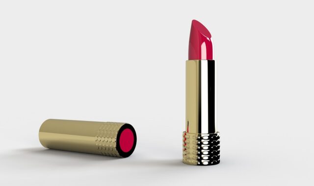
For beauty brands in 2026, the best packaging design is not simply the most attractive jar, tube, compact, or bottle. It is packaging that protects the formula, communicates quickly, works in both retail and online channels, supports credible sustainability claims, and remains practical in daily use. In beauty, the pack has to carry both brand emotion and technical responsibility. A refillable cream jar that feels premium but is hard to open will frustrate users. A recyclable bottle with unclear claims can confuse shoppers. A viral makeup compact that fails in shipping can damage trust. This article looks at beauty packaging through that wider lens, with guidance that applies across skincare, makeup, fragrance, haircare, and personal care. For more category context, visit our packaging design section.
The five criteria that separate strong packaging from decoration
Beauty packaging has always carried symbolic value. It signals price, identity, sensorial promise, and product performance before the formula is tried. The difference in 2026 is that packaging is also judged as a system. Regulators, retailers, recycling programs, e-commerce teams, creators, and consumers all shape what a successful pack must do.

| Criterion | What it means for beauty packaging | Why it matters |
|---|---|---|
| Formula protection | The pack protects stability, hygiene, dosing, light-sensitive ingredients, leakage risk, and contamination risk. | A beautiful design fails if it weakens the product experience or safe use. |
| Usability | The closure, pump, applicator, label, refill, or dispensing path is intuitive and repeatable. | Beauty routines are habitual, so small points of friction can become reasons not to repurchase. |
| Brand recognition | Shape, color, typography, material, and touch create a clear identity without relying on category clichés. | Crowded shelves and social feeds reward packaging systems that can be recognized quickly. |
| End-of-life logic | Material choices, component separation, labels, decoration, and claims are designed with collection and recycling realities in mind. | Recyclable, recycled, refillable, and compostable claims are facing closer scrutiny. |
| Commercial fit | The packaging matches the product price, channel, shipping model, refill economics, and production scale. | A design that works for a luxury serum may not work for a mass-market body wash. |
These criteria help avoid a common mistake in beauty: treating packaging design as a visual exercise after the product concept is already fixed. The stronger approach is to make packaging part of product strategy from the start. The choice between a jar, airless pump, dropper, stick, pouch, compact, or refill pod should be tied to the formula, positioning, use occasion, and expected disposal pathway.
Why 2026 beauty packaging decisions are more constrained
Regulation is now a design input
For beauty brands selling in Europe, or preparing to do so, Regulation (EU) 2025/40 on packaging and packaging waste has made recyclability and waste reduction near-term planning issues. The regulation was adopted on December 19, 2024, published in the Official Journal on January 22, 2025, and applies from August 12, 2026. Its wider roadmap points toward packaging being designed for recycling from 2030 and assessed against recycled-at-scale expectations from 2035, subject to the detailed delegated and implementing acts.
This does not mean every beauty pack must immediately become identical, plain, or plastic-free. It does mean that structural choices made today can create compliance work later. Heavy mixed-material pumps, metallized decorations that interfere with sorting, unnecessary secondary packaging, and oversized containers with empty space are becoming harder to defend. Packaging teams need to ask not only whether a pack looks premium, but whether each part can be identified, sorted, separated, reused, or recycled in the markets where it will be sold.
Labeling and claims still have to do basic work
In the United States, cosmetic packaging must support required labeling information such as product identity, net quantity of contents, ingredient declaration, business information, directions, and warnings when applicable. The principal display panel still has to communicate the product clearly. That practical requirement should influence design early, especially for small bottles, mini formats, compacts, lip products, and multi-language packs.
Environmental claims require the same discipline. The FTC Green Guides remain an important reference for U.S. environmental marketing claims. One widely cited point is that unqualified recyclable claims should be avoided when appropriate recycling facilities are not available to a substantial majority of consumers or communities where the product is sold. For beauty packaging, this matters because many components are small, decorated, flexible, dark, mirrored, mixed-material, or pump-based. A material may be technically recyclable, but the finished pack may still face collection and sorting barriers.
Consumers want sustainability without inconvenience
Market research from firms and industry groups in 2026 continues to show a tension that beauty teams know well: people say they care about sustainability, but they still prioritize convenience, value, hygiene, and product performance. Mintel has highlighted convenience and practical usability as major barriers for refillable beauty formats, while Sustainable Packaging Coalition refill-at-home research has pointed to ease of use, convenience, product availability, and familiar bottle formats as important adoption factors.
The design lesson is direct. Refill systems cannot rely on virtue alone. A refill should be easy to buy, easy to store, easy to pour or insert, and satisfying to use. If the refill pouch spills, the pod feels cheap, the outer pack is hard to clean, or the refill costs too close to the full product, consumers may not form the habit. In beauty, sustainable packaging succeeds when the system feels better, not merely less bad.
Design moves that work across beauty categories
Simplify the structure before changing the material
Many packaging debates begin with material choice: glass versus plastic, aluminum versus paper, refill pouch versus rigid container. Material matters, but structure often matters first. A simplified pack with fewer components, less decoration, and a clearer disposal path may perform better than a fashionable material used in a confusing way.
Mono-material design is one practical direction. In simple terms, the goal is to keep the main body and related components within the same material family where possible, such as a polypropylene pack with compatible polypropylene elements or a polyethylene bottle with compatible closure choices. This can be especially relevant for pumps, airless systems, caps, and refillable components that have historically used several materials. The trade-off is that the design still has to meet performance needs, including dispensing accuracy, product compatibility, shelf life, and premium feel.
Make refill design convenient before making it symbolic
Refillable beauty packaging can make sense in categories with repeat purchase behavior, including hand wash, body wash, shampoo, conditioner, moisturizer, deodorant, fragrance, and selected color cosmetics. The design model still has to match the product and channel. At-home refill pouches can be convenient for bathroom and shower routines. Durable outer jars can work for premium skincare if the refill insert feels secure and hygienic. Fragrance refills can support luxury value when the original bottle is worth keeping.
The mistake is to add a refill system without reducing friction. A good refill design should answer several practical questions: Can the consumer understand the refill path in seconds? Can the refill be completed without tools? Is there a clear hygiene strategy? Is the refill visibly cheaper or materially lighter than buying the full pack again? Does the primary pack still look desirable after months of use? If the answer is unclear, the refill story may remain a marketing claim rather than a functioning system.
Choose materials by role, not by trend
Glass can support a premium look and strong barrier properties, but it adds weight and breakage risk. Aluminum can feel durable and works well for certain refillable or reusable systems, but it may not suit every formula or price point. Paper-based solutions can reduce plastic in cartons, sleeves, inserts, and some emerging molded formats, but they must be evaluated for coating, barrier, durability, and recyclability. Plastic remains common because it is lightweight, versatile, and cost-effective, but mixed structures and unsupported claims are under growing pressure.
The best packaging design choice is therefore category-specific. A sunscreen stick needs portability, heat resistance, and controlled dispensing. A vitamin C serum may need light and air protection. A pressed powder compact needs hinge durability and decisions on the mirror or pan. A shampoo bottle must work with wet hands. A luxury fragrance bottle is partly an object of display. Treating all of these as the same sustainability problem leads to weak design.
Design for the screen as well as the shelf
Beauty packaging is now discovered through retail shelves, e-commerce thumbnails, short-form video, creator content, subscription boxes, and bathroom counter photos. That changes visual priorities. The pack must be recognizable at small sizes, readable in a product grid, and interesting in use. Tactile finishes, audible clicks, clean dispensing, visible texture, and distinctive silhouettes can create sensory value, but they should not become decorative clutter. See also: BEAUTY INGREDIENTS.
Strong screen-first packaging often uses fewer, sharper signals: a memorable color system, a distinctive cap shape, a clear applicator reveal, or a label hierarchy that makes product type and benefit easy to read. This is especially important for emerging beauty brands that cannot rely on decades of brand recognition.
A practical decision framework for beauty teams
Before approving a packaging concept, teams can test it against a simple sequence. First, define the product job: protection, dosing, portability, hygiene, gifting, refill, sampling, or prestige. Second, define the channel: mass retail, specialty beauty, pharmacy, salon, direct-to-consumer, marketplace, travel retail, or professional use. Third, define the end-of-life claim: recyclable, refillable, reusable, recycled content, reduced plastic, compostable, or no claim. Fourth, check whether the claim can be substantiated in the actual selling markets.
Only after those decisions should the visual system be finalized. This sequence keeps the design from becoming expensive decoration. It also helps align creative, regulatory, procurement, sustainability, and marketing teams before tooling, decoration, and supplier commitments lock the project in place.
A useful test is to write the front-of-pack message, back-of-pack instructions, e-commerce bullet points, and disposal guidance before the artwork is complete. If the team cannot explain the design clearly in plain language, the pack is probably too complicated. Clarity is not the enemy of premium beauty. In many categories, clarity is now part of the premium cue.
Common packaging design mistakes to avoid
- Designing only for first purchase. Beauty packaging must still feel good after repeated use, travel, wet hands, makeup residue, and bathroom storage.
- Using sustainability language that is too broad. Terms such as eco-friendly, green, planet-safe, or sustainable are weak unless the specific benefit is explained and supported.
- Adding refillability without habit design. A refill is not successful unless consumers can easily buy it, use it, and understand the value.
- Overdecorating recyclable materials. Labels, inks, adhesives, sleeves, metallization, and colorants can affect sorting and recycling outcomes.
- Ignoring small-format readability. Mini skincare, lip products, mascaras, compacts, and samples often lose essential information when branding takes too much space.
- Confusing luxury with excess. Premium design can come from proportion, material honesty, precise dispensing, tactile quality, and restraint, not only from weight and layers.
The strongest beauty packaging concepts usually resolve a constraint elegantly. They do not simply add more material, more finishes, or more claims. A well-designed closure, a cleaner refill path, a more legible label, or a simpler component structure can create more value than a dramatic redesign that complicates production and disposal.
What to prioritize if you are redesigning now
If a beauty brand is redesigning packaging in late 2026, the most reliable priority is not to chase every trend. Start with the packs that create the most risk or opportunity: high-volume items, heavy multi-material components, hard-to-read labels, fragile e-commerce formats, refill candidates, and products carrying broad sustainability claims. These are the areas where design decisions can materially affect cost, compliance, customer experience, and reputation.
For many brands, the next step is a packaging audit. Map each SKU by material, component count, decoration method, supplier, claim, market, refill possibility, and known consumer complaint. The audit does not need to be complicated to be useful. It will usually reveal obvious improvements: remove unnecessary secondary packaging, standardize caps, improve label hierarchy, switch to clearer disposal instructions, reduce oversized void space, or pilot a refill for the products consumers repurchase most often.
The best packaging design is rarely the result of one bold visual idea. It is the result of many aligned choices: a structure that works, a material that fits, a claim that can be supported, a label that informs, and a brand language that feels distinctive without making the pack harder to recover. That is the standard beauty packaging now has to meet.
Frequently asked questions
What makes beauty packaging design successful in 2026?
Successful beauty packaging in 2026 protects the formula, is easy to use, communicates clearly, fits the sales channel, and has a realistic end-of-life strategy. Visual appeal still matters, but it should not override usability, compliance, or credible claims.
Is refillable packaging always the best option?
No. Refillable packaging works best when the product is repurchased often, the refill is convenient, the primary pack is durable, and the refill meaningfully reduces material or waste. If the system is difficult, expensive, messy, or confusing, adoption may remain low.
Are glass and aluminum always more sustainable than plastic?
Not automatically. Glass and aluminum can support premium and refillable systems, but they also have trade-offs such as weight, breakage, cost, and formula compatibility. Plastic can be practical and lightweight, but it needs careful design, material simplification, and responsible claims.
How should beauty brands use sustainability claims on packaging?
Claims should be specific, limited to the actual benefit, and supported by evidence for the markets where the product is sold. A precise statement such as made with post-consumer recycled plastic, where verified, is usually stronger than a broad claim such as eco-friendly.
What is the role of visual identity in best packaging design?
Visual identity turns a functional container into a recognizable beauty product. Color, form, typography, finish, and touch should express the brand clearly while still leaving room for required label information, usability, and end-of-life guidance.