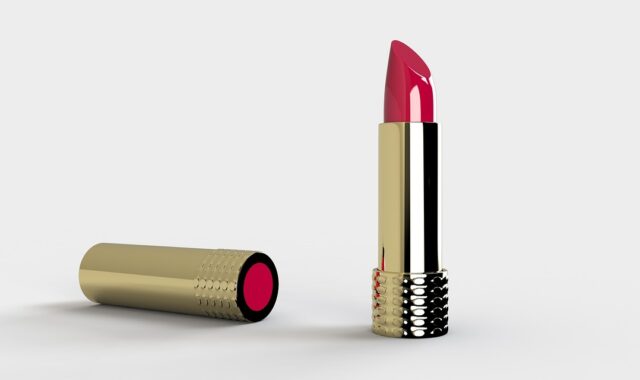
Brand packaging design for cosmetics that balances aesthetics, compliance and sustainability
Why brand packaging design now means more than shelf appeal
Brand packaging design in beauty is the planned system of shape, material, typography, color, claims and user interaction that turns a formula into a recognizable, trustworthy product. For cosmetics, strong packaging has to do several jobs at the same time: communicate the brand quickly, present required product information clearly, and make sustainability or refill claims credible rather than decorative. Effective beauty packs are not just attractive containers. They must work on a store shelf, as an e-commerce thumbnail, in the hand, and at the point of disposal.
For beauty brands, that makes packaging a strategic design decision, not a final styling step. A serum bottle, lipstick case, jar, carton or refill pouch can signal price position, ingredient philosophy, routine fit and responsibility within seconds. More packaging design decisions are now judged by whether they reduce confusion and support the claims printed on the pack.
What brand packaging design includes in beauty
In cosmetics, brand packaging design covers far more than the artwork on a box. It starts with the structure of the primary package: the tube, bottle, jar, compact, stick, palette or airless pump that directly holds the product. It also includes the secondary package, such as a carton, sleeve, insert or e-commerce shipper, when that package carries essential information or creates the first branded impression.
The design system brings together several visible and functional elements:
- Brand identity: logo placement, color palette, typography, illustration style and visual codes that make a product recognizable across a range.
- Product navigation: shade names, skin type cues, usage order, product size, texture description and benefit hierarchy.
- Material and finish: glass, plastic, aluminum, paperboard, PCR content, soft-touch coatings, embossing, metallic details or matte surfaces.
- Use experience: grip, opening force, dispensing control, mess reduction, portability, refilling and storage.
- Post-use guidance: recycling, separation, refill instructions or responsible disposal information where those claims are properly supported.
The best systems create consistency without making every SKU look identical. A cleanser, moisturizer and treatment serum can share the same brand language while using different colors, closure types or information hierarchy to help shoppers choose quickly.
Compliance is part of the design system
Beauty packaging has to persuade, but it also has to inform. In the United States, FDA cosmetic labeling guidance requires key information to appear with enough prominence for consumers to notice and understand it under customary purchase conditions. The principal display panel is expected to identify the product, describe its nature or use, and include an accurate net quantity statement. Other required details, such as business information, ingredient declaration, directions or warnings where applicable, need proper placement and readability.
Design teams should therefore avoid treating compliance copy as a late-stage space problem. If typography, illustration or decorative finishes crowd required information, the package may look polished but fail at a basic communication task. The challenge is especially sharp for small cosmetics, where tubes, minis, sample jars and lip products have limited printable area.
A practical compliance-aware workflow starts with a label map before the visual design is finalized. The team should identify which surfaces are available, which statements are required, which claims need substantiation, and which information belongs on the primary container versus the outer carton. This does not replace legal or regulatory review, but it can reduce the risk of rebuilding attractive artwork after production files are already prepared.
Sustainability claims need visible proof
Sustainability has become a defining pressure in beauty packaging, and it is also one of the easiest areas to overstate. NielsenIQ reported in 2023 that many consumers consider sustainability more important than before, while also showing that shoppers define sustainability in different ways. For one person it may mean less plastic; for another it may mean recycled content, refillability, lower waste, fewer ingredients, local sourcing or clear disposal instructions.
That variety makes vague language risky. The FTC Green Guides in the United States emphasize that environmental marketing claims should be supported by competent and reliable evidence. They also warn that recyclable claims may need qualification when appropriate facilities are not available to a substantial majority of consumers or communities, and that an unqualified refillable claim should not be made unless the marketer provides a practical way to refill the package.
The European regulatory direction is also pushing design teams toward clearer labeling and circularity. Regulation (EU) 2025/40 on packaging and packaging waste entered into force in February 2025, with rules beginning to apply on a phased basis from 12 August 2026. The European Commission has described the direction of travel as less wasteful packaging, more recyclability, clearer labeling, recycled-content requirements for plastic packaging and stronger support for reuse and refill options. For brands selling internationally, this makes packaging architecture a long-term compliance issue, not just a seasonal redesign brief.
What this means for cosmetic packaging language
Words such as sustainable, clean, recyclable, refillable, compostable and plastic-free should be treated as claims that need context. A stronger design approach is to be specific: identify the material, state the recycled-content percentage when verified, explain whether a component must be separated, or describe exactly how a refill system works. Specificity makes the pack more useful for shoppers and less vulnerable to greenwashing criticism.
A practical framework for cosmetic brand packaging design
A beauty packaging project usually moves faster when the team separates strategy from decoration. The following sequence helps connect brand expression with practical constraints.
- Define the product role. Decide whether the pack must introduce a new brand, stretch an existing line, signal luxury, simplify a routine, support clinical credibility or stand out in a crowded color cosmetics category.
- Build the information hierarchy. Rank the front-of-pack messages before choosing fonts and finishes. Product type, core benefit, shade, size and usage cue cannot all compete at the same visual level.
- Select the structural format. Match the formula and user behavior to the format. A pump can protect a lotion but may complicate recyclability; a jar can feel sensorial but may raise hygiene or dosing questions; a refill pouch may reduce material but requires clear transfer instructions.
- Test claims against evidence. Before printing environmental, ingredient or performance claims, confirm what can be supported. Claims should be easy to understand without making the pack read like a legal disclaimer.
- Prototype across real touchpoints. Review the design as a shelf unit, a mobile thumbnail, an unboxing experience, a bathroom object and a used package ready for disposal.
This framework helps avoid a common mistake: designing only for the first glance. Beauty packaging should attract attention, but the second and third interactions often determine whether the consumer trusts the product enough to buy it again. See also: BEAUTY INGREDIENTS.
Packaging choices that change perception and usability
Design choices that look purely aesthetic often create functional consequences. A muted color palette may signal clinical calm, but it can also make product variants harder to tell apart. A heavy component can feel premium, but it may increase material use and shipping weight. A mirrored finish can look luxurious, but it may reduce readability under bright retail lighting.
| Design choice | Brand role | User or operational risk to test |
|---|---|---|
| Color palette | Signals category, mood and price position | Variants may become difficult to distinguish in small sizes or online thumbnails |
| Pack silhouette | Creates recognition beyond the label | Unusual shapes can reduce filling, packing or display efficiency |
| Typography | Builds personality and hierarchy | Decorative fonts can weaken ingredient, shade or instruction readability |
| Material choice | Communicates weight, durability and sustainability cues | Mixed materials may complicate recycling or component separation |
| Closure and dispenser | Shapes hygiene, dosing and daily ritual | Pumps, droppers and caps can leak, clog or add hard-to-recycle parts |
| Refill system | Shows long-term product thinking | Adoption depends on convenience, refill availability and clear instructions |
| Outer carton | Provides storytelling and regulatory space | Excessive secondary packaging may conflict with waste-reduction expectations |
Recent refill research from the Sustainable Packaging Coalition and Provoke Insights, published in 2026, points to a useful design lesson for skincare: convenience, ease of use, product availability and familiar formats are major motivators. In other words, refillable packaging does not succeed simply because it sounds progressive. It succeeds when the package makes the lower-waste behavior simple.
Common mistakes beauty brands can avoid
One frequent mistake is using premium cues without a clear brand reason. Metallic foils, thick walls, heavy caps and sculptural shapes can elevate a product, but they should support the positioning and the expected use case. When every detail is designed to look expensive, the product may become visually noisy, costly to produce or harder to recycle.
A second mistake is hiding important information. Small type, low contrast, curved surfaces and crowded layouts can make shades, warnings, ingredient lists or disposal instructions difficult to read. In beauty, trust often comes from clarity. If a shopper has to rotate the pack repeatedly to understand what the product is and how to use it, the visual identity is working against the purchase.
A third mistake is treating sustainability as a graphic style. Earth tones, leaf icons and kraft textures do not prove environmental performance. If the pack claims recycled content, refillability, source reduction or recyclability, the design should explain the basis of the claim in plain language and avoid implying more than the packaging can support.
Finally, brands should avoid copying category codes so closely that the product becomes invisible. Many skincare packs use minimalist white space, clinical typography and soft neutrals. Many makeup packs rely on black, gold, nude and reflective finishes. These codes can be effective, but they need a distinctive element, such as a recognizable silhouette, color logic, illustration system or naming structure, to build memory over time.
Frequently asked questions
What is brand packaging design?
Brand packaging design is the coordinated use of structure, materials, graphics, information hierarchy and user experience to express a brand through its product packaging. In beauty, it must also support labeling clarity, safe use, product differentiation and credible claims.
Why is packaging design important for cosmetics?
Cosmetic products are often judged before they are tested. Packaging helps shoppers understand the product type, price level, benefit, shade or routine role. It can also improve repeat use through better dispensing, storage and readability. However, packaging is only one part of performance; formula quality, pricing, reviews and distribution still matter.
What should appear on the front of cosmetic packaging?
The front should prioritize the product identity, core use or benefit, brand name and legally required front-panel information such as net quantity where applicable. Strong packaging avoids overloading the front with every claim and instead uses the side, back or outer carton for supporting details.
Are refillable cosmetic packages always more sustainable?
Not automatically. Refillability depends on the amount of material used, the durability of the main pack, the design of the refill, transport impacts, cleaning or return systems, and whether consumers actually use the refill option. A refill claim is strongest when the brand provides a clear, accessible and ongoing way to refill.
How can smaller beauty brands improve packaging on a limited budget?
Smaller brands can start with a clear visual system, readable labels, consistent color logic and stock packaging that fits the product well. Distinctive typography, strong information hierarchy and verified claims often create more trust than expensive finishes. Before scaling, test the design in photographs, in hand and in shipping conditions.