Luxury packaging design for beauty brands in 2026
Luxury now has to feel considered, not oversized
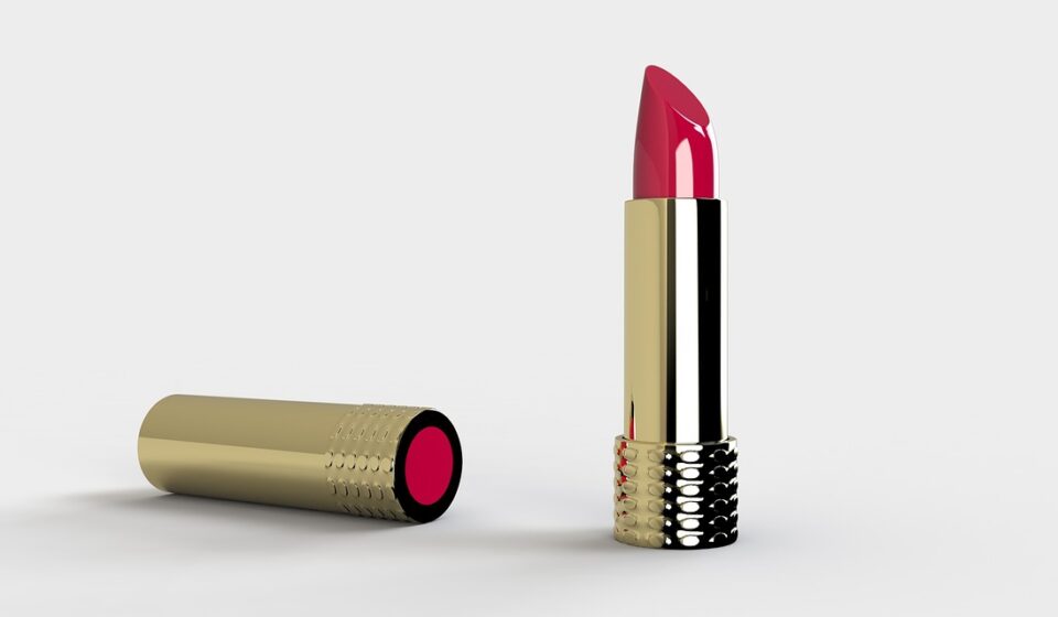
Luxury packaging design in beauty is no longer defined by a heavy jar, a thick carton, shiny foil or a dramatic unboxing sequence. In 2026, premium packaging has to justify the material, space and cost it uses. The strongest packs combine sensory pleasure, clear product information, refill or recycling logic, and a visual identity that works both on a bathroom shelf and on a small mobile screen.
That does not mean luxury beauty packaging has to become plain. It means every detail needs a purpose. Weight should suggest durability or stability. Texture should improve handling. Decoration should strengthen the brand world. Sustainability claims should be specific enough to stand up to scrutiny.
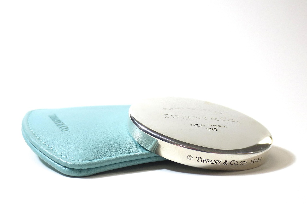
For brands, designers and buyers following packaging design, the shift is from decorative luxury to accountable luxury. Beauty consumers still respond to glass, aluminium, tactile paper, precise closures and carefully controlled finishes. They are also more alert to overpackaging, hard-to-recycle formats and vague environmental language. The result is a more disciplined approach to premium beauty packaging.
What makes beauty packaging feel luxurious today
Luxury packaging creates confidence before the product is used. In skincare, fragrance, color cosmetics and hair care, the pack sets expectations about formula quality, sensoriality, safety and brand taste. The cue may be visual, such as a controlled color palette or a sculptural silhouette. It may be tactile, such as a soft-touch coating, frosted glass, a magnetic closure, an embossed mark or a smooth pump action. It may also be practical: clean dispensing, easy opening, controlled dosage and a refill system that does not feel like a downgrade.
The current beauty market makes that balance more demanding. McKinsey and The Business of Fashion reported in 2025 that the core beauty segments of skincare, cosmetics, hair care and fragrance were expected to reach $590 billion by 2030. The same research pointed to rising online penetration, with global beauty e-commerce projected to exceed 30% by 2030. Packaging now has to make many of its first impressions through thumbnails, short videos and marketplace images before a shopper ever touches the product in store.
Luxury beauty packaging therefore has to perform in two environments. Offline, it must feel satisfying in the hand and stable in use. Online, it must read quickly, communicate category and price tier, and avoid looking generic when reduced to a small image. A minimal jar can look elegant on a vanity but disappear in search results. A highly ornate pack can attract attention online but feel wasteful or impractical at home. Modern luxury sits between those extremes.
Materials are becoming a strategic design choice
Material selection is now one of the clearest ways to signal what a beauty brand stands for. Mintel’s recent beauty packaging analysis noted that glass is strongly associated with luxury, freshness and premium quality, while aluminium is gaining relevance because it can feel durable, modern and compatible with refillable systems. Paperboard, molded pulp and mono-material plastic formats are also becoming more important, especially when brands want to reduce unnecessary complexity in secondary packaging.
Glass still communicates premium value, but weight needs a reason
Glass remains a powerful material for luxury skincare and fragrance because it offers clarity, coolness, density and shelf presence. Frosted glass can soften the look of clinical skincare. Clear glass can emphasize color, transparency and formula confidence. Colored glass can help protect light-sensitive formulas while creating a brand asset. The risk is that glass becomes a shortcut, with extra weight used to imply value without improving function.
A more careful approach starts with the job the glass must do. Does the base thickness improve stability? Does the shoulder shape create a distinctive silhouette? Does the finish make the product easier to grip with wet hands? If the answer is no, the design may be adding cost and transport burden without adding much real luxury.
Aluminium supports refill logic and a more technical premium mood
Aluminium is increasingly relevant for refillable deodorants, hair care, body care and some skincare formats. It can feel sleek and durable, and it supports a less ornamental kind of luxury associated with precision, portability and longevity. For prestige beauty, aluminium works best when the refill mechanism is simple and the surface finish resists visible wear. A beautiful outer case that scratches easily can weaken the long-term value story.
Paper and molded fiber are moving beyond plain eco signals
Paper-based formats are not automatically luxurious or sustainable, but they are becoming more sophisticated. Rigid paper tubes, molded fiber inserts and textured cartons can create a tactile impression without relying on multiple laminates, plastic windows or excessive foiling. The design challenge is to avoid making paper look like a compromise. Color depth, embossing, paper grain, structural precision and clean opening tabs can make a paper-based pack feel designed, not merely reduced.
Refillable packaging must protect the luxury ritual
Refills are often discussed as a sustainability solution, but beauty consumers judge them through convenience and emotion as much as through waste reduction. Mintel reported that almost half of surveyed consumers had purchased a refill pack in 2024, while a smaller share had bought a refillable product. Its analysis also highlighted convenience as a major barrier, including U.S. consumer resistance to in-store refilling. McKinsey’s 2025 beauty discussion made a similar point from another angle: sustainable packaging can support growth only when consumers see it as valuable and not as a loss of experience.
That is especially true in luxury beauty. A refill that feels flimsy, messy or visually disconnected from the original pack can make the consumer feel they are buying an inferior version. Strong refillable luxury design usually follows four principles:
- The permanent component feels worth keeping. The outer case, jar, compact or fragrance bottle should have enough durability and emotional value to stay on display.
- The refill action is intuitive. Consumers should not need tools, force or guesswork to replace a cartridge, pouch or pan.
- The hygiene story is clear. Seals, closures and contact surfaces need to reassure users that the formula remains protected.
- The refill does not erase the brand moment. Secondary packaging may be lighter, but it should still carry enough visual identity to feel intentional.
In luxury packaging design, the refill is not just a backend sustainability feature. It is part of the ritual. The sound of a click, the clean removal of an insert, the way a compact closes after replacement, and the appearance of the refill on arrival all influence whether the system feels premium or inconvenient.
Regulation is turning restraint into a design requirement
Regulatory pressure is increasingly shaping packaging briefs, particularly for brands that sell across markets. The EU Packaging and Packaging Waste Regulation, Regulation (EU) 2025/40, was adopted on December 19, 2024, published in the Official Journal on January 22, 2025, and applies from August 12, 2026. It introduces a broad framework for packaging sustainability, recyclability, minimisation, labelling and conformity documentation. Designers do not need to become lawyers, but they do need to understand that structural choices made today may affect future market access.
One important direction is packaging minimisation. By January 1, 2030, manufacturers or importers placing packaging on the EU market must ensure that weight and volume are reduced to the minimum necessary for functionality, taking account of shape and material. The regulation also points toward recyclability performance requirements, with packaging expected to meet design-for-recycling criteria from 2030 or later depending on delegated acts and timing. From 2038, stricter recyclability grades are expected for market placement.
For beauty brands, this does not mean every premium carton, insert or closure is automatically problematic. It means decorative volume, empty space and mixed-material complexity need a defensible purpose. A design file should be able to explain why each component exists, what function it performs and how it affects end-of-life treatment. See also: BEAUTY INGREDIENTS.
| Design decision | Luxury risk | Stronger 2026 response |
|---|---|---|
| Oversized secondary carton | May look impressive but can appear wasteful, especially in e-commerce | Use tighter dimensions, structural reveals, paper texture and precise opening details instead of empty space |
| Mixed-material pump or cap | Can complicate recycling and future compliance documentation | Explore mono-material systems, separable components or clearly justified performance choices |
| Vague green claims | Creates reputational and regulatory risk | Use specific, substantiated claims such as recycled content percentage, refill count or material reduction versus a defined previous pack |
| Heavy glass base | May be read as excess if it adds no function | Balance weight with grip, stability, refillability, protection or a distinctive silhouette |
Claims and labels should be designed as part of the luxury experience
Premium design often favors quiet surfaces, but beauty packaging still has to communicate required information. In the United States, FDA cosmetic labeling guidance states that the principal display panel should include the product name, identity or use, and net quantity of contents. Ingredient declarations and other required information must also be conspicuous and understandable under customary purchase conditions. In the European Union, cosmetic product labeling under Regulation (EC) No 1223/2009 includes required information on the container and packaging, such as responsible person details, nominal content, date-related information where applicable, precautions and ingredient listing.
These requirements create a real design problem: how can a luxury pack remain elegant while carrying dense information? The answer is not to hide required copy until it becomes unreadable. A better approach is typographic hierarchy. Put the most important purchase information where it is expected, give regulatory text sufficient contrast, and reserve decorative space for elements that carry brand meaning. Luxury is not reduced by clarity; in many categories, clarity increases trust.
Environmental language also needs discipline. The U.S. Federal Trade Commission’s Green Guides emphasize that environmental marketing claims should be truthful, not misleading and supported by competent and reliable evidence. They also indicate that recyclable claims should be qualified when appropriate recycling facilities are not available to a substantial majority of consumers or communities where the product is sold. In design terms, icons, leaves, earth tones and words such as eco, clean, green or planet-friendly should not be treated as decoration unless the claim can be supported.
Digital shelves are changing premium visual codes
Luxury packaging used to be judged mainly through department-store counters, boutique shelves and printed campaigns. Today, the pack also has to work in marketplace grids, livestreams, social posts, unboxing clips and brand-owned e-commerce. That shift changes the value of contrast, silhouette and recognizable assets.
Small-screen packaging needs a few instantly legible features. These may include a distinctive cap shape, a consistent label architecture, a memorable color field, a recognizable emboss, or a unique relationship between bottle and carton. If every product relies on beige minimalism, the brand may look premium in isolation but indistinct in a crowded online environment. If every product relies on metallic shine, the pack may look noisy and hard to photograph.
For beauty brands, the most resilient visual systems combine restraint with one proprietary cue. That cue might be an unusual pump profile, a repeatable closure geometry, a house color used sparingly, or a tactile pattern that appears across cartons and containers. The goal is not to shout. It is to be identifiable at a glance.
A practical checklist for luxury beauty packaging design
Before approving a luxury packaging concept, teams can use a simple review to test whether the design is adding real value or only cost.
- Brand fit: Does the structure express the brand’s price tier, category and point of view without copying familiar luxury codes?
- Material purpose: Can every major material choice be explained by protection, durability, refillability, sensory value or identity?
- Handling: Is the pack easy to open, grip, dispense, close and store in real bathroom or vanity conditions?
- Refill or end-of-life logic: If the pack is refillable, is the refill action pleasant and clear? If it is recyclable, are the material choices and claims realistic for the market?
- Compliance space: Is there enough readable space for product identity, net contents, ingredients, warnings and market-specific labeling?
- Digital performance: Does the pack remain recognizable in a thumbnail, a short video and a marketplace comparison view?
- Claim discipline: Are sustainability and material claims specific, documented and limited to what can be supported?
The most successful luxury packaging design now comes from subtraction as much as addition. Remove weak decoration, reduce unnecessary voids, simplify material combinations where possible, and invest in the details that consumers actually feel: closure, weight balance, texture, dosing, legibility and repeat use.
Frequently asked questions
Is luxury packaging design the same as expensive packaging?
No. Expensive packaging can still feel poorly designed if it is awkward, wasteful or visually generic. Luxury packaging design is about perceived value, brand coherence, sensory quality, protection and trust. Cost may support those goals, but it does not replace them.
Are refillable beauty packs always better for luxury brands?
Not always. Refillable systems work best when the permanent pack is durable and desirable, the refill process is simple, and the consumer does not feel a loss of hygiene, convenience or beauty. A poorly executed refill can damage the premium experience.
What materials are most associated with premium beauty packaging?
Glass, aluminium, high-quality paperboard, textured labels, precision plastics and well-finished closures can all communicate premium value. The right choice depends on the formula, category, shipping model, refill strategy, market regulations and brand identity.
How can a beauty brand make sustainable packaging feel luxurious?
Use sustainability as a design constraint rather than a slogan. A lighter carton can feel premium if the structure is precise, the paper is tactile and the opening experience is intentional. A refill can feel luxurious if the permanent component is beautiful and the replacement action is clean.
What should designers avoid in luxury cosmetic packaging?
Avoid decorative bulk, unreadable labels, vague environmental claims, fragile finishes that age badly, and mixed-material details that add complexity without improving the user experience. Modern luxury is judged by how well the whole system performs, not by one dramatic surface effect.