Custom packaging design for beauty products that balances shelf appeal, compliance, and sustainability

Why custom packaging design matters in beauty
Custom packaging design for beauty products is no longer just a branding exercise. A package has to show product positioning quickly, protect the formula through distribution, leave enough space for required label information, support a credible sustainability story, and still feel good in daily use. For cosmetics, skincare, fragrance, and personal care products, the strongest design process usually starts with structure and materials before moving into color, typography, finishes, and decoration. That sequence matters. A beautiful carton, jar, bottle, tube, or compact can still fail commercially if it is hard to read, expensive to fill, fragile in shipping, or difficult to recycle.
This article looks at custom packaging design from a practical editorial perspective for beauty brands, packaging teams, and product marketers. For more packaging-related insights, visit the packaging design category.

Start with the packaging architecture before the artwork
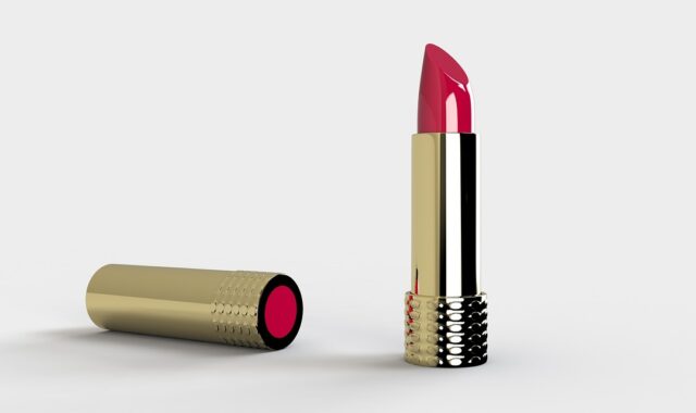
The first decision in a beauty packaging project is not the logo size or the color palette. It is the packaging architecture: the combination of primary packaging, secondary packaging, closures, applicators, inserts, shipping protection, and label surfaces. A serum may need a glass bottle, dropper, label, carton, insert, and e-commerce shipper. A lipstick may involve a molded bullet case, shade label, tamper feature, display carton, and retail tray. Each layer adds cost, material, information space, and environmental impact.
Good architecture answers four questions early:
- What must touch the formula, and what only supports presentation or shipping?
- Which surfaces are visible at retail, during unboxing, and in daily use?
- Where will required product identity, net contents, ingredients, warnings, batch codes, and company information appear?
- Which components are essential, and which are mainly decorative?
Beauty teams often focus on the outer carton because it carries the strongest branding. The primary container, however, usually shapes the customer’s longer-term impression. Pumps that clog, caps that crack, labels that wrinkle near water, or jars that tip easily can weaken trust even when the first impression is attractive. A useful design brief should define the role of every layer, whether that role is protection, communication, dispensing, hygiene, refill, retail display, anti-tamper control, or gift appeal.
Build beauty cues without sacrificing label clarity
Beauty packaging relies heavily on cues such as finish, weight, transparency, proportion, texture, and color. Frosted glass may suggest clinical skincare or fragrance luxury. Soft-touch coatings can feel premium, but they may complicate recyclability or scuff resistance. Minimalist typography can communicate a modern position, but it can also reduce legibility when the type is too small or the contrast is too low.
Public FDA cosmetics labeling guidance emphasizes that required information should be prominent, conspicuous, and understandable under ordinary purchase and use conditions. In design terms, decorative layouts should not crowd out identity, net quantity, directions, warnings, business information, or ingredient declarations where they are required. The hierarchy should help the shopper understand three things quickly: what the product is, what it does in non-misleading terms, and how much product is inside.
For beauty products, the front panel typically carries the strongest emotional message, while the side or back panels carry more detailed information. That division should not become an excuse for unreadable text. A better approach is to create an information map before final artwork. The map can assign space to product identity, benefit language, usage directions, ingredient list, warnings, symbols, barcode, shade name, batch code, recycling instructions, and market-specific translations.
Typography also needs functional review. Thin serif type, metallic foil, pale ink on pastel paper, and curved labels can look elegant in renderings but become difficult to read under store lighting or bathroom conditions. On small beauty packs, contrast, spacing, and a clean hierarchy often do more for perceived quality than another decorative finish.
Design sustainability claims around evidence, not mood
Sustainability is one of the most sensitive areas in custom beauty packaging. Many consumers respond to paper textures, refill language, recycled content claims, reusable containers, and simplified materials. At the same time, regulators and watchdogs increasingly expect environmental claims to be specific, qualified, and supported.
In the United States, the FTC Green Guides are a key reference for environmental marketing claims. The guidance says recyclable claims should be qualified when recycling facilities are not available to at least 60 percent of the consumers or communities where the product is sold. It also distinguishes recycled content, refillable, renewable material, and general environmental benefit claims. The practical lesson for packaging design is straightforward: the visual language should not imply more than the package can support.
For example, a carton printed on kraft board may look more natural, but that appearance alone does not prove lower impact. A plastic jar may include recycled content, but the claim should identify the percentage and whether it refers to the jar, cap, label, or total package. A refillable compact should be supported by an actual refill system, not only a removable pan that consumers cannot easily replace.
Material decisions should consider both brand experience and end-of-life pathways. The Association of Plastic Recyclers Design Guide is commonly used in North America to evaluate how labels, closures, inks, adhesives, colorants, and component size affect compatibility with plastics recycling. Even when a beauty brand is not making an on-pack recyclability claim, this design-for-recycling view can help avoid conflicts, such as pairing a recyclable bottle with a label or adhesive that interferes with the recycling process.
Watch the regulatory direction in cross-border packaging
Packaging regulation is not identical across markets, so global beauty packaging should not assume that one claim, symbol, or labeling layout will work everywhere. The European Union’s Packaging and Packaging Waste Regulation, Regulation (EU) 2025/40, applies from 12 August 2026 on a phased basis. The regulation is part of a broader move toward packaging reduction, recyclability, reuse, recycled content, and harmonized labeling rules across the EU market.
For beauty brands, the design implication is that packaging decisions made today may need to remain flexible through future updates. Material composition, recyclability performance, empty-space reduction, consumer sorting information, and documentation can all become design constraints, not just compliance tasks handled after artwork approval.
This does not mean every beauty product must look plain or identical. It does mean design teams should add a compliance checkpoint during the early concept stage. A custom package that relies on unusual mixed materials, permanent decorations, dark pigments, multilayer components, or decorative overpack may need additional review before scaling. Cross-border brands should also track local rules on language, ingredient names, warning statements, environmental labels, extended producer responsibility, and product classification.
The safest conclusion is not that one material is always best. Glass, aluminum, paperboard, PET, PP, PE, and flexible formats can all be appropriate in different contexts. The better question is whether the chosen system fits the formula, logistics, market rules, recycling or reuse pathway, and brand promise. See also: BEAUTY INGREDIENTS.
Prototype for e-commerce, refills, and real bathroom use
Beauty packaging is often judged in three environments: the product page, the delivery box, and the bathroom shelf. Each creates different design pressures. Online, the pack must read clearly at thumbnail size and communicate shade, texture, size, and product type without overpromising. In shipping, it must withstand vibration, compression, temperature changes, and leakage risk. In daily use, it has to cope with wet hands, residue, repeated opening, and storage near heat or light.
Prototype testing should therefore include more than a visual mockup. Teams can review:
- Drop and compression risk for primary and secondary packaging.
- Leakage and closure performance after repeated opening.
- Label adhesion on curved, squeezable, chilled, or wet surfaces.
- Readability of ingredients and directions under realistic lighting.
- Ease of dispensing for different hand sizes and mobility needs.
- How refill components are removed, purchased, identified, and installed.
Refill systems deserve special attention. They can reduce material use in some cases, but only when the refill is easy to understand, easy to buy, compatible with the original container, and attractive enough for repeat use. If the refill pouch or cartridge uses complex materials, leaks easily, or lacks clear instructions, the sustainability story becomes weaker. A refill strategy is a service and logistics system as much as it is a packaging design choice.
A practical custom packaging design brief for beauty products
A clear brief reduces expensive redesigns. It also helps creative, regulatory, purchasing, and operations teams evaluate the same concept from different angles. The following checklist can be adapted for skincare, makeup, fragrance, hair care, and personal care launches.
| Brief section | What to define | Why it matters |
|---|---|---|
| Product and formula | Viscosity, fill volume, sensitivity to light or air, usage frequency, and hygiene needs. | The formula determines suitable containers, closures, dispensing systems, and barrier requirements. |
| Market and channel | Retail, salon, marketplace, direct-to-consumer, travel size, gift set, or refill format. | Channel affects display surfaces, shipping strength, barcode placement, and unboxing priorities. |
| Brand positioning | Clinical, luxury, playful, natural, professional, mass, or minimalist. | Positioning guides material feel, finish, color, typography, and decoration level. |
| Mandatory information | Identity, net contents, ingredients, directions, warnings, company details, batch code, and local language needs. | Information planning prevents late artwork changes and unreadable layouts. |
| Material strategy | Target materials, recycled content, recyclability review, refill option, and decoration limits. | Material choices influence cost, claims, compliance, weight, durability, and environmental messaging. |
| Testing plan | Compatibility, leakage, abrasion, drop, compression, readability, and user testing. | Testing reveals problems that renderings and supplier samples may hide. |
| Cost and scalability | MOQ, tooling, lead time, component availability, decoration steps, and pack-out labor. | A concept must be manufacturable at the launch volume and realistic at reorder volume. |
The most useful briefs include constraints as well as ambitions. A statement such as “premium sustainable skincare packaging” is too broad. A stronger brief might say: “A 30 ml serum package for e-commerce and specialty retail, using a refill-compatible primary container where feasible, readable English labeling, restrained decoration, no unqualified environmental claims, and materials reviewed against current recyclability guidance.” That level of detail still leaves room for creativity, but it gives the design team a clearer target.
Common mistakes to avoid
One common mistake is designing the outer carton first and discovering too late that the container, label, or closure does not support the intended claim or user experience. Another is assuming that heavier packaging always feels more premium. Weight can suggest quality, but it can also increase freight impact and feel out of step with a sustainability message.
Brands should also be cautious with vague words such as eco-friendly, green, clean, non-toxic, recyclable, biodegradable, or refillable unless the claim is specific and supported. Decorative icons can imply claims even when the text does not. A leaf symbol, circular arrow, or earthy color palette may be read by shoppers as an environmental message, so the design should match the substantiation.
Finally, custom packaging design should not be judged only by launch photography. The real test is whether the package protects the product, communicates clearly, supports truthful claims, works through the supply chain, and remains pleasant after weeks of use.
Frequently asked questions
What is custom packaging design for beauty products?
It is the process of creating packaging structure, materials, graphics, labeling space, finishes, and user experience around a specific beauty product and brand position. It can include bottles, jars, tubes, cartons, labels, applicators, inserts, refill systems, and e-commerce shippers.
Should beauty packaging design start with graphics or structure?
It should usually start with structure, formula needs, channel requirements, and labeling space. Graphics become more effective when the package already supports protection, dispensing, readability, compliance review, and cost targets.
Can custom beauty packaging be both premium and recyclable?
Sometimes, but it depends on the material system, decorations, labels, adhesives, closures, and local recycling access. A premium look does not automatically prevent recyclability, but mixed materials, dark colors, permanent metallization, or incompatible labels can create challenges.
How should brands handle sustainability claims on packaging?
Claims should be specific, qualified where needed, and supported by evidence. Instead of using broad language, brands should identify the exact component and claim, such as a stated percentage of post-consumer recycled content or clear refill instructions tied to a real refill system.
Why is label readability important in cosmetic packaging?
Beauty packaging must communicate product identity, quantity, ingredients, directions, warnings, and other required information where applicable. If the design makes important information hard to find or hard to read, the package may create both consumer confusion and compliance risk.