Packaging coffee design in 2026 that balances freshness, sustainability and shelf appeal
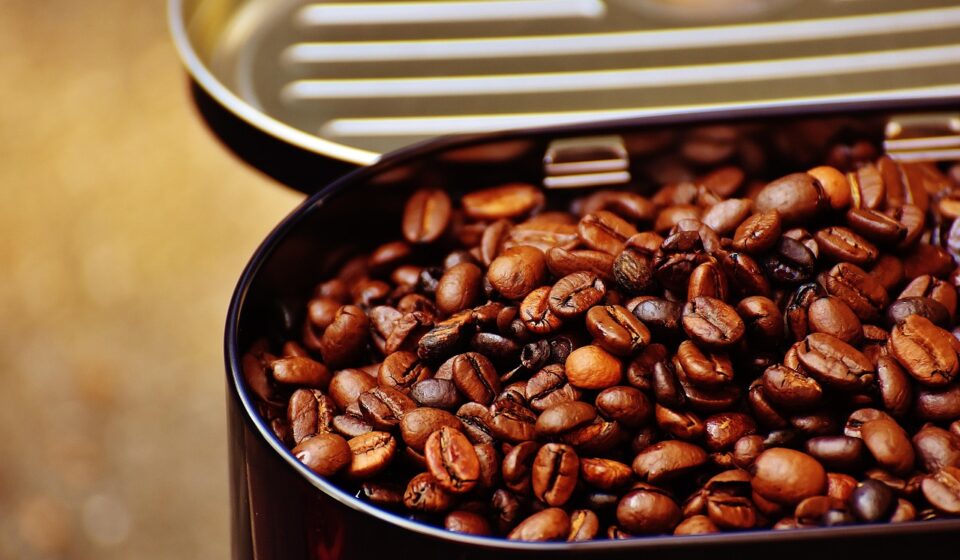
What strong coffee packaging has to solve in 2026
Packaging coffee design in 2026 is no longer just a graphics exercise. A successful pack has to protect roasted coffee from oxygen, moisture and light, manage carbon dioxide released after roasting, communicate quality cues quickly, and avoid sustainability claims that the material structure cannot support. The front panel may attract attention, but the bag structure, valve choice, label hierarchy and end-of-life message determine whether the design feels credible.
The most useful way to plan a coffee bag is to treat it as a compact information system. It should tell shoppers what the coffee is, why it costs what it costs, how fresh it is, and how to store or dispose of the pack. For more ideas across formats, see our packaging design archive.
Freshness should lead the design brief
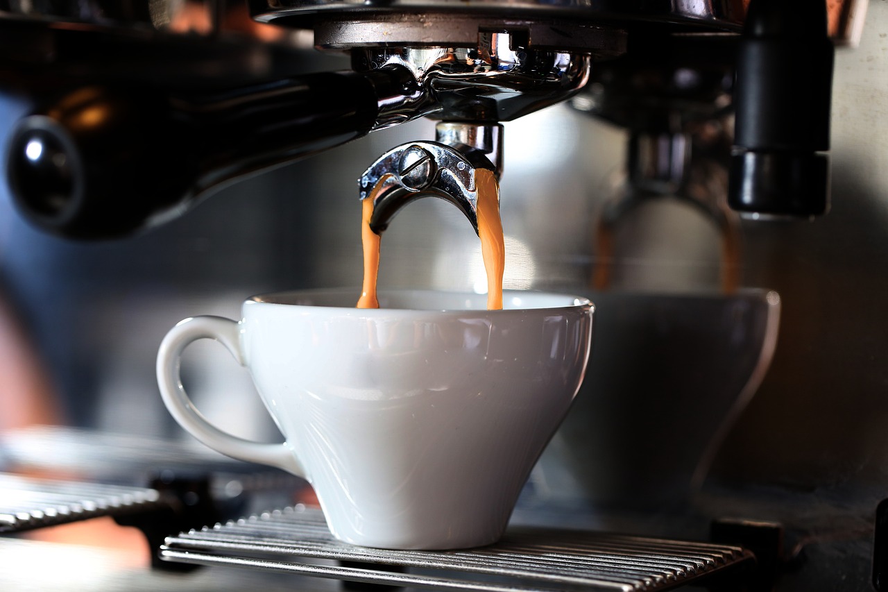
Roasted coffee continues to release carbon dioxide after roasting. That is why many whole-bean packs use high-barrier films and one-way degassing valves. The structure helps slow exposure to outside oxygen and moisture, while the valve lets internal gas escape without turning the bag into a balloon. Food packaging research, including studies indexed by PubMed and Wiley, has linked coffee freshness indicators with barrier performance and storage conditions, so these are functional design choices rather than technical decoration.
Designers should build the visual system around those needs instead of fighting them. A valve should not be hidden under a thick label, covered by a sticker, or placed where consumers are likely to fold the bag. The seal area needs enough clear space for reliable production. If a tin-tie, zipper or fold-over top is used, the graphics should still read clearly after the first opening because many customers keep coffee in the original bag.
- Barrier structure: Helps limit oxygen, moisture and light exposure, but may affect recyclability depending on layers and local systems.
- Degassing valve: Useful for fresh whole-bean coffee, especially when bags are sealed soon after roasting.
- Reseal feature: Supports daily use and protects the brand impression after purchase.
- Storage message: Simple wording such as “seal tightly and store away from heat and light” can be more useful than decorative copy.
Sustainability has moved beyond a natural-looking bag
Kraft textures, muted colors and green icons can suggest an eco-friendly product, but they do not prove one. The sustainability question is now more technical: what materials are used, whether the pack is recyclable or compostable in the markets where it is sold, how much material is necessary, and whether the claim can be documented. A paper-like outer layer can still be part of a multi-material laminate that is difficult to recover through curbside recycling.
Several public sources point to this shift. The European Commission states that Regulation (EU) 2025/40 on packaging and packaging waste entered into force on February 11, 2025 and generally applies from August 12, 2026. The regulation covers the packaging life cycle, including prevention, recyclability, reuse and waste handling. In the United States, CalRecycle describes California’s SB 54 framework as moving toward 2032 targets for recyclable or compostable packaging and higher plastic recycling performance. The Sustainable Packaging Coalition’s recent trend reporting also emphasizes that extended producer responsibility is pushing brands to understand material categories, weights and recovery pathways.
For coffee packaging, this creates a real trade-off. The pack must preserve aroma and shelf life, but high-barrier laminates can be harder to recycle. A responsible design brief should therefore ask material suppliers for current documentation, confirm whether claims apply to the actual selling market, and avoid vague statements such as “earth friendly” unless the basis is clear.
The front panel must make specialty coffee easier to understand
Specialty coffee shoppers often look for origin, roast level, process, tasting notes and roast date. Newer shoppers, however, may be overwhelmed by the same information. Strong packaging design turns complex coffee data into an easy reading path. The first read should identify the roaster or product line. The second should explain the coffee style. The third can carry the deeper details that enthusiasts expect.
The Specialty Coffee Association’s 2026 Coffee Design Awards, announced in San Diego on April 11, 2026, continued to recognize packaging alongside branding and coffee environments. That matters because it reflects how packaging is now judged as part of the customer experience, not only as a container. Awarded and shortlisted specialty coffee packs often use a clear system: repeatable brand assets, color or illustration to separate varieties, and restrained technical information that does not crowd the front.
A useful hierarchy for retail shelves and online thumbnails is:
- Brand mark: Large enough to be recognized in a shelf set or marketplace grid.
- Coffee identity: Blend name, origin or product line in plain language.
- Flavor cue: Short tasting notes that feel concrete, not poetic to the point of confusion.
- Freshness cue: Roast date or batch label in a consistent, easy-to-find area.
- Format cue: Whole bean, ground, capsules or single-serve format if relevant.
Color, typography and illustration should serve the range
Coffee brands often start with one beautiful bag and later discover that the system cannot scale. A limited release, house blend and decaf may look attractive individually but confusing together. Before finalizing graphics, designers should test the full range on one shelf, in a shipping carton, and as small mobile images.
Color can organize roast level, origin region or flavor family, but it should be used consistently. Typography needs to balance character with legibility, especially on small labels applied during production. Illustration can create emotional value, but it should not hide the practical details that help a customer buy with confidence.
| Design choice | What it can communicate | Risk to check |
|---|---|---|
| Minimal monochrome bag | Precision, premium quality, modernity | May make varieties hard to distinguish |
| Bright color system | Approachability and fast range navigation | Can feel generic if color logic is unclear |
| Origin-led illustration | Story, place and craft | Should avoid stereotypes or unsupported origin claims |
| Sticker label system | Flexibility for small batches | Needs durable printing and consistent placement |
Production details can protect or weaken the concept
A coffee bag is handled more aggressively than many premium packages. It is filled, sealed, shipped, squeezed, opened, resealed and stored in kitchens. The chosen finish therefore has to survive real use. Matte films can look refined but show scuffs. Dark inks can make small type harder to read. Metallic effects may signal quality but can complicate photography for ecommerce. Compostable or recyclable structures may also have different stiffness, seal behavior or print limitations than conventional laminates. See also: BEAUTY INGREDIENTS.
Before launch, designers and roasters should review printed prototypes, not only digital mockups. Check barcode contrast, roast-date stamping, label adhesion, zipper feel, valve position and how the bag stands when partially filled. If the pack will be sold online, photograph it under realistic lighting and confirm that the main message is readable in a square thumbnail.
Connected packaging should add utility, not clutter
QR codes and short URLs can extend the package without overcrowding it, but they need a clear purpose. The strongest uses are brew guides, batch information, sourcing updates, freshness education, subscription reordering or disposal instructions. A code that only opens a generic homepage wastes space and rarely improves the customer experience.
Connected packaging is especially useful when the physical bag needs to stay clean. For example, the front can carry the coffee name and flavor direction, while a QR experience can explain farm details, processing method and brewing recommendations. The key issue is maintenance: if the landing page is outdated, the package becomes less trustworthy.
A practical checklist for coffee packaging redesigns
- Define the primary channel before designing: retail shelf, cafe counter, subscription mailer and ecommerce thumbnails reward different choices.
- Choose the pack structure before final artwork so the design respects valve placement, zipper position, seal areas and label application.
- Document sustainability claims by material, market and recovery pathway instead of relying on visual cues.
- Create a range architecture that can handle core blends, seasonal lots, decaf and limited releases without confusion.
- Keep roast date, net weight, product format and storage guidance easy to find.
- Test legibility at small sizes because many coffee purchases begin on mobile screens.
- Review local labeling and environmental claim rules with qualified guidance before printing large volumes.
Frequently asked questions
Does every coffee bag need a degassing valve?
Not every format needs one, but fresh whole-bean coffee often benefits from a one-way valve because roasted beans release carbon dioxide after roasting. Ground coffee, nitrogen-flushed packs, capsules or coffee that has rested before packing may require a different packaging decision. The choice should match roast timing, fill process and shelf-life goals.
Is kraft coffee packaging always more sustainable?
No. A kraft look does not automatically mean the full structure is recyclable, compostable or lower impact. Many coffee bags combine paper, plastic, foil or coatings to achieve barrier performance. The sustainability claim should be based on the actual material structure and the recovery system available in the market where the product is sold.
What should appear on the front of a specialty coffee bag?
The front should make the coffee easy to choose. In most cases, that means brand name, coffee identity, roast or flavor direction, product format and a clear route to deeper details. Origin, process, variety and altitude can be valuable, but they should be organized so new customers are not forced to decode the bag before buying.
How can a small roaster improve packaging without a full redesign?
Start with hierarchy and consistency. Use a repeatable label template, place roast dates in the same location, simplify tasting notes, improve barcode and small-type legibility, and check that stickers do not cover valves or seals. These changes can make a modest bag feel more professional without replacing the entire packaging system.
What is the main design mistake in coffee packaging?
The most common mistake is treating the bag as a poster instead of a working package. Coffee packaging must preserve freshness, support production, explain the product and remain usable after opening. Strong graphics help, but they cannot compensate for unclear information, weak resealing, unsupported claims or poor material choices.
Final takeaway
Effective packaging coffee design balances sensory promise with practical discipline. The strongest coffee packs make the product easy to understand, protect the freshness the roaster worked to create, and communicate sustainability with evidence rather than styling alone. In 2026, the winning direction is not simply louder graphics or greener-looking materials; it is a coherent system in which structure, print, information and brand story work together.