Packaging design and printing for beauty products that look premium and stay compliant
What packaging design and printing must achieve
Packaging design and printing for beauty products has to do more than create shelf appeal. The package must make the product easy to understand, protect the formula, work in retail and ecommerce settings, and still leave enough space for required label information. A premium carton, jar, tube, or bottle can quickly lose value if the ingredient list is difficult to read, the label scuffs in a bathroom, or a sustainability claim cannot be supported.
Effective beauty packaging projects usually begin with structure and copy, not decoration. Designers, printers, brand teams, and regulatory reviewers should agree on the selling unit, label panels, materials, finishes, claim language, and proofing process before artwork is released. As of October 2026, brands selling in the United States or European Union also need to consider FDA cosmetic labeling guidance, FTC Green Guides, and the EU Packaging and Packaging Waste Regulation where those markets apply. This article provides general industry information and is not legal advice.
Begin with the label before the decoration
Beauty packaging often has limited printable space, especially on lip products, small jars, ampoules, travel sizes, and cylindrical containers. That makes label planning a practical starting point for the creative process. In the United States, FDA cosmetic labeling guidance distinguishes the principal display panel from information panels. The principal display panel typically carries the product identity and net quantity of contents, while information panels carry items such as directions for safe use, warnings, business name and place, ingredient declaration, and other required information.
For designers, the front panel should not be treated as a poster with regulatory copy added at the end. The layout should first reserve space for the product name, product type, quantity statement, core claim, and any warning that needs front-panel visibility. The information panel then has to account for legibility, reading order, ingredient length, languages, container curvature, and seam position.
Ingredient naming is one place where packaging and compliance meet directly. FDA guidance says cosmetic ingredients generally need to appear on an information panel where consumers can find them when purchasing. It also explains that in the U.S. market, ingredients should use common or usual names in English; international naming terms may be placed in parentheses where appropriate but should not replace the required English name. Products with SPF claims or certain acne, dandruff, or antiperspirant claims may be both cosmetics and drugs, so their labeling needs separate review.
MoCRA has also made final packaging records more important. FDA explains that the responsible person is the manufacturer, packer, or distributor whose name appears on the cosmetic label. Serious adverse event reporting can require the responsible person to provide a copy of the label on or within the retail packaging. In practice, beauty brands should archive approved artwork, dielines, proofs, and production samples instead of treating a printed carton as a one-time creative file.
For brands selling into the EU, the Packaging and Packaging Waste Regulation began applying on a phased basis from 12 August 2026. The European Commission describes the regulation as a move toward more recyclable packaging, clearer labeling, packaging minimization, and recycled content targets for plastic packaging in later phases. Even when a brand is based outside Europe, these rules can affect the packaging brief if products are shipped to EU consumers or retailers.
Convert brand strategy into a printable system
Good beauty packaging is a system, not a single attractive front panel. A skincare line may need jars, airless pumps, tubes, cartons, sample sachets, shipper boxes, and ecommerce images. A makeup line may need shade names, color indicators, compact labels, mirror warnings, and multilingual inserts. The design language has to work across these formats without forcing every SKU into a crowded layout.
A useful design system separates information into levels. The first level is recognition: brand name, line name, and visual identity. The second level is shopping clarity: product type, shade, skin concern, format, quantity, and key benefit. The third level is required and supporting information: ingredients, warnings, directions, distributor details, recycling instructions, batch or lot area where needed, and barcode or QR code space.
Typography should be tested at production size, not only on a large monitor. Thin serif letters, pale metallic ink, low-contrast beige-on-white layouts, and small reverse type can look refined in a presentation but fail in print. On glossy film or curved plastic, reflections can make small text harder to read. On uncoated paperboard, ink gain can soften fine details. For beauty packaging, elegance should come from hierarchy, spacing, and material control rather than from reducing essential text until it barely fits.
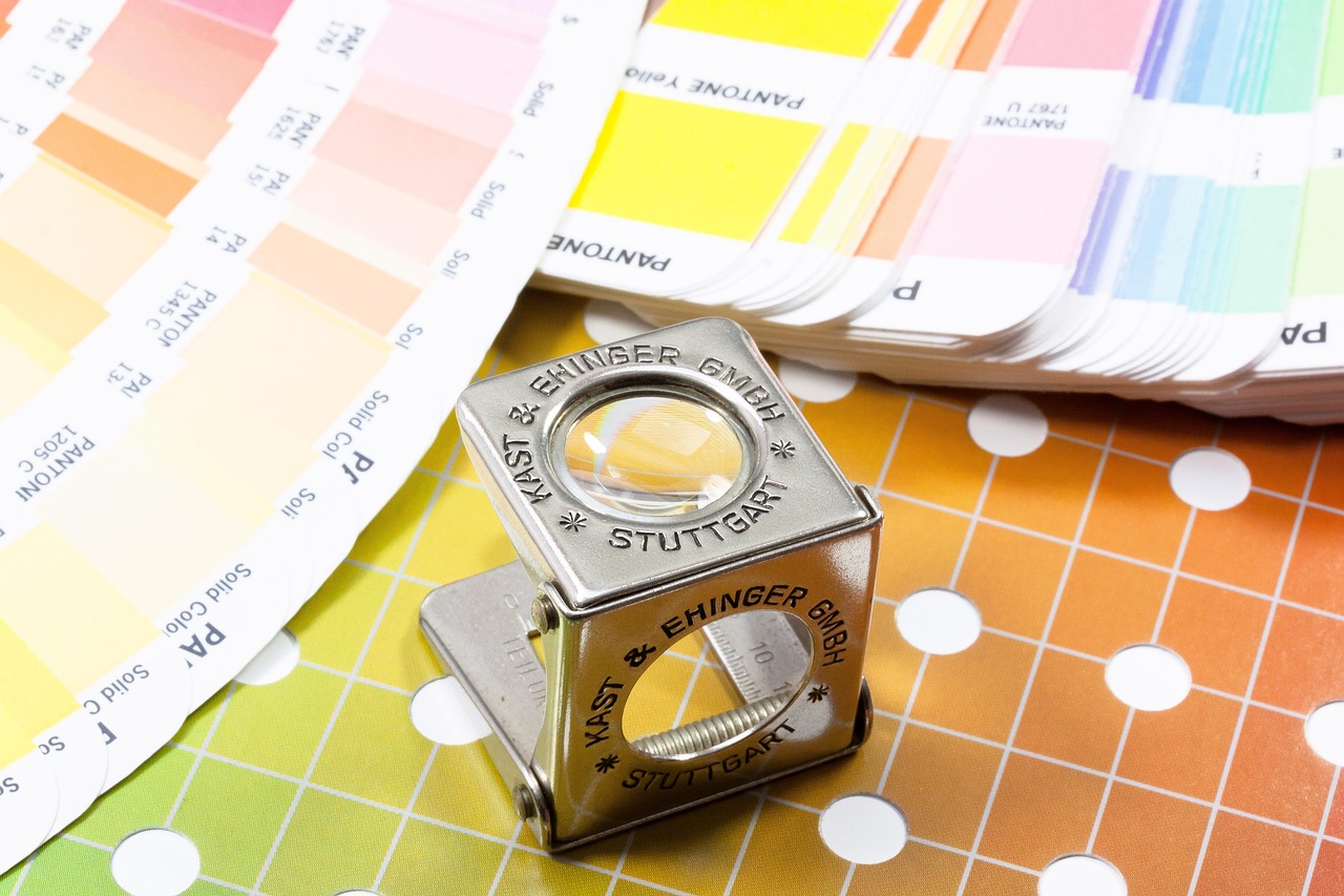
Color also needs a production strategy. A hero brand color may require spot color control, while photographs or gradients may be better suited to CMYK printing. Metallic foils, pearlescent substrates, and clear labels can shift the perceived color of nearby graphics. Designers should define which colors are brand-critical, which are flexible, and which can vary slightly by substrate or printing process. Without that decision, the same product line can look inconsistent across labels, tubes, cartons, and online imagery.
Choose materials that support the formula and the printing method
Material choice affects appearance, compatibility, cost, minimum order quantity, sustainability claims, and print performance. Beauty packaging often has to withstand oils, alcohol, water, pumps, shipping, bathroom humidity, and repeated handling. A finish that looks strong on a press proof may fail if it softens, scratches, or lifts when exposed to the formula or the user environment.
| Packaging format | Design advantage | Printing considerations | Common risk |
|---|---|---|---|
| Glass jar or bottle | Premium weight, clarity, and strong shelf presence | Often paired with labels, screen printing, hot stamping, or decorated closures | Heavy shipping weight, breakage risk, and component-level recycling complexity |
| PET or PP bottle | Lightweight and common for cleansers, toners, and lotions | Labels, shrink sleeves, direct decoration, or molded color can be used | Ink or label adhesion issues if surface treatment is not controlled |
| Laminated or plastic tube | Convenient for creams, masks, and travel formats | Offset, screen, flexo, and foil effects are common depending on tube supplier | Distortion near the crimp, limited copy space, and scuffing during use |
| Airless pump | Protects sensitive formulas and supports a premium routine | Decoration may involve labels, color-matched parts, caps, and actuator details | Multi-material construction can make broad recycling claims harder to support |
| Paperboard carton | Provides space for education, claims, ingredients, and brand storytelling | Offset printing, digital printing, embossing, foil, varnish, and coatings are common | Over-decoration can reduce recyclability or make the carton feel inconsistent with sustainability language |
| Pressure-sensitive label | Flexible, efficient, and suitable for many small or medium beauty runs | Face stock, adhesive, liner, varnish, and die-cutting all affect final quality | Wrinkling, lifting edges, poor wet resistance, or label panel mismatch on curved containers |
The right material decision is usually made through testing, not assumption. Formula compatibility, drop tests, rub tests, label adhesion, hot and cold stability, and shipping simulation provide more value than a purely aesthetic review. For beauty products, the consumer experience continues after purchase; a label that peels near a sink or a carton that crushes in transit weakens brand trust.
Match print process and finishing to the job
Different printing methods solve different problems. Digital printing can be useful for short runs, seasonal drops, influencer kits, and rapid SKU testing because it reduces setup barriers and makes versioning easier. Offset printing is common for paperboard cartons when the brand needs sharp detail, consistent color, and efficient larger runs. Flexographic printing is widely used for labels and flexible packaging, especially when roll-to-roll production is required. Screen printing and hot stamping can add opacity, texture, and metallic effects on selected components.
The finishing plan should support the product story. Matte varnish can signal softness or clinical minimalism. Gloss varnish can make color appear deeper and more energetic. Spot UV can highlight a logo or ingredient story. Embossing can make a carton feel tactile without adding another color. Foil can create a premium cue, but it should be used with restraint because tiny foil text can fill in, crack, or become hard to read.
Printing decisions also affect timing. Foil dies, embossing tools, custom closures, special coatings, and color-matched components can add lead time. If a brand expects fast replenishment, the production design should avoid decorative choices that are difficult to repeat. A simpler package that can be printed consistently may perform better than an elaborate design that causes delays or rejects. See also: BEAUTY INGREDIENTS.
Sustainability claims need proof, not decorative wording
Sustainability has become a major part of beauty packaging, but vague language is risky. The FTC Green Guides state that environmental marketing claims should be truthful, not misleading, and supported by competent and reliable evidence. The guidance also explains that unqualified recyclable claims should be qualified when appropriate recycling facilities are not available to at least 60 percent of the consumers or communities where the product is sold. Recycled content claims should identify the amount when only part of the product or package uses recycled material.
This matters in design because sustainability copy often appears directly on the front panel, carton side panel, or ecommerce image. A phrase such as ‘eco-friendly packaging’ is weaker than a specific, component-based claim that can be supported. Better packaging language identifies the component, material, percentage, and limitation where needed. For example, a carton claim, bottle claim, cap claim, and pump claim may require different wording because those components may not be recycled in the same way.
Refillable beauty packaging needs particular care. FTC guidance says marketers should not make an unqualified refillable claim unless a way to refill the package is provided. A decorative refill message is not enough if consumers cannot reasonably access refill pouches, refill stations, or a take-back and refilling system. Design teams should check whether the claim is supported by the actual commercial model, not only by the package concept.
For EU-facing packaging, the PPWR increases the pressure to design for recyclability, reduce unnecessary packaging, improve labeling clarity, and prepare for recycled content requirements where they apply. The design implication is straightforward: do not wait until artwork approval to ask whether a component, coating, sleeve, label, adhesive, pigment, or insert creates a recycling or claims problem. Sustainability should be part of the structural brief.
Build a print-ready workflow
A reliable packaging workflow reduces late-stage changes, proofing confusion, and avoidable reprints. Start with a locked product brief that includes formula type, package format, markets, claim language, required copy, barcode or QR code needs, shade or SKU architecture, and launch timing. Then create a dieline or technical drawing from the actual supplier, not a generic template. Even small dieline differences can affect glue flaps, seams, safety zones, and the way a label wraps around a curve.
- Copy and compliance review: confirm product identity, quantity statement, directions, warnings, ingredients, distributor details, claims, and market-specific language before final art.
- Material and decoration specification: define substrate, coating, label stock, adhesive, inks, foils, varnishes, embossing, and any special finish.
- Artwork preflight: check bleed, safe zones, overprint settings, resolution, color mode, barcode quiet zones, white ink plates, and variable data areas.
- Proofing: review digital proofs for content, contract or press proofs for color, and physical mockups for scale, readability, and shelf impact.
- Production approval: approve a first article, drawdown, or press sample where the risk justifies it.
- Retained samples: keep approved samples and final print files so repeat orders can be compared against a clear reference.
Brands should also plan for operational marks. Batch or lot codes, expiration or period-after-opening symbols where used, tamper-evident features, retailer labels, import stickers, and language overlays can disrupt a clean design if they are added after printing. Reserve practical space early, especially on small containers.
Common mistakes that raise packaging costs
The most expensive packaging problems often begin as small decisions. A design may use a foil effect that needs a custom tool, then change the logo size after the tool is made. A carton may be approved before ingredients are final, forcing a reprint. A label may look balanced on a flat PDF but wrap awkwardly around a bottle. A sustainability claim may pass a design meeting but fail review because it describes the whole package when only one component qualifies.
Another common mistake is designing the primary container and carton separately. Consumers experience them as one product. The tone of voice, color, claim hierarchy, shade system, and disposal instructions should feel connected. If the carton says premium clinical skincare while the bottle label looks promotional, the product sends mixed signals.
A better approach is to create a packaging decision matrix before final art. List each component, material, print method, finish, required copy, claim, risk, test needed, and approval owner. This gives the project team a practical information advantage over a purely visual mood board because it connects creative direction to production reality. For more beauty packaging ideas and related industry updates, explore the packaging design section.
Frequently asked questions
What is the difference between packaging design and printing?
Packaging design defines the structure, visual identity, copy hierarchy, claims, materials, and user experience. Printing turns that approved design into physical packaging through a selected production method, substrate, ink system, and finish. The two should be planned together because the printing method can change how colors, small type, foils, coatings, and textures actually appear.
Which printing method works well for small beauty product runs?
Digital printing is often practical for small runs, limited editions, sampling, and SKU testing because it supports versioning with fewer setup demands. However, the right method depends on the substrate, decoration, volume, durability requirements, and color expectations. Labels, cartons, tubes, and shrink sleeves may each require a different production route.
Can a beauty brand call its packaging recyclable?
A recyclable claim should be specific, supportable, and qualified when needed. In the U.S., FTC guidance says marketers should qualify recyclable claims when appropriate recycling facilities are not available to at least 60 percent of relevant consumers or communities. Brands should also distinguish between components, because a carton, jar, cap, pump, label, and sleeve may not have the same recycling pathway.
How early should a printer be involved in a beauty packaging project?
A printer or packaging supplier should be involved before final artwork, ideally during dieline, material, and finish planning. Early input can prevent avoidable issues with bleed, seams, adhesive, ink coverage, color matching, foil limits, barcode placement, and production lead time.