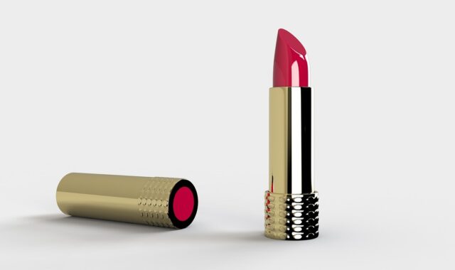
Packaging design for beauty products in 2026

What packaging design needs to do now
For beauty brands, packaging design in 2026 has to solve several jobs at once. It still needs to look desirable on a shelf, as a product-page thumbnail, and in social content. At the same time, it must carry required cosmetic information, use sustainability claims carefully, protect the formula, withstand shipping, and help consumers understand how to use, refill, recycle, or repurchase the product. The strongest beauty packs are no longer only attractive containers. They combine product interface, compliance surface, brand signal, and material decision in a very limited space.
This matters because beauty is a visually led category with tight packaging constraints. A 30 ml serum bottle, a lipstick carton, or a compact refill system leaves little room for confusion. Poor hierarchy makes claims harder to trust. Weak material choices can make recycling difficult. Overdesigned secondary packaging can feel wasteful. The design question is no longer only “What will stand out?” It is “What will stand out, stay clear, and still work after regulation, logistics, and consumer behavior are considered?”
Why the beauty packaging brief has changed
Beauty packaging used to be judged mainly by shelf impact, premium cues, and brand consistency. Those factors still matter, but the brief has expanded. McKinsey’s 2026 State of Beauty analysis expects the global beauty market to keep growing through 2030, while also noting a more complex channel landscape that includes marketplaces, social commerce, livestreaming, specialty retail, and price-tier fragmentation. In design terms, a package now has to perform in more contexts than a traditional counter display.
A moisturizer jar may first appear as a two-centimeter image on a phone screen. A fragrance carton may need to signal luxury in a gift set while also meeting recyclability expectations. A refill pouch may reduce material use, but only if it is easy to store, pour, identify, and dispose of correctly. These are not purely aesthetic decisions. They affect comprehension, conversion, repeat use, and waste outcomes.
Beauty packaging also carries a high burden of trust. Consumers often look for formula type, skin or hair concern, shade name, active positioning, scent, usage instructions, warnings, net quantity, and ingredient information. If the visual system is beautiful but the buyer cannot quickly understand what the product is, who it is for, and how it should be used, the design has missed its first commercial task.
Recyclability is becoming a design constraint, not a finishing note
Sustainability has been part of beauty packaging conversations for years, but in 2026 the issue is more operational. The EU Packaging and Packaging Waste Regulation, Regulation (EU) 2025/40, began to apply on a phased basis from 12 August 2026. The European Commission describes the direction clearly: packaging should become less wasteful, more recyclable, better labeled, and more supportive of reuse and refill systems. The regulation also points toward 2030 as a key date for recyclability expectations.
Even for brands outside the EU, the design lesson is relevant. Recyclability cannot be added at the end by placing a symbol on the pack. It is shaped by the resin, coating, colorant, closure, label adhesive, pump construction, decoration method, and whether different materials can be separated in real recycling systems. A frosted bottle, metallic label, multi-material pump, or laminated pouch may look premium, but each choice can complicate sorting or recovery.
In the United States, the Federal Trade Commission’s Green Guides remain an important reference for environmental marketing claims. The guides warn against broad environmental claims that are not properly qualified and note that recyclable claims should be qualified when appropriate recycling facilities are not available to at least 60 percent of consumers or communities where the product is sold. The practical takeaway for packaging design is direct: visual language should not imply more than the packaging system can support.
| Design decision | Why it matters | What to verify before launch |
|---|---|---|
| Mono-material bottle or jar | Can simplify sorting and recycling compared with mixed-material packs | Compatibility of cap, label, ink, and decoration with the target recycling stream |
| Dark, opaque, or metallic decoration | May support premium positioning but can affect sortability or material value | Whether the decoration interferes with optical sorting or recycling guidance |
| Refill pouch or pod | Can reduce rigid packaging use when adopted repeatedly | Actual refill path, consumer instructions, spill control, and end-of-life guidance |
| Minimal outer carton | Can reduce material and shipping volume | Whether the primary pack still carries required information and protects the formula |
Refillable packaging succeeds only when the system is designed
Refills are attractive in beauty because they offer a visible circularity story. They also suit categories where consumers return to a product repeatedly, such as fragrance, skin care, hand wash, body care, and some hair care formats. But a refill is not automatically sustainable, convenient, or credible. It becomes meaningful only when the refill route is easy enough for consumers to use more than once.
Mintel’s 2026 beauty packaging analysis described refillable formats in the US as growing only modestly between 2022 and 2024, with convenience remaining a significant hurdle. That matches a common design reality: consumers may support refills in principle but abandon them if the refill pack is messy, hard to open, difficult to store, unavailable where they shop, or more confusing than buying a new primary pack.
The FTC Green Guides also treat refillable claims with caution. A marketer should not make an unqualified refillable claim unless there is a way to refill the package, such as a collection-and-refill system or a product consumers can use to refill the original container. For packaging designers, this means the refill system needs to be visible in both structure and information architecture. The primary pack should make clear that it is designed to be kept. The refill pack should make product identity, shade, scent, size, and compatibility unmistakable. Instructions should be short, legible, and placed where the user needs them.
A good refill system usually answers five questions on the pack: which original container it fits, how to open it, how to refill without contamination or waste, how to close or dispose of the refill unit, and how many uses or quantities it provides. If any of those answers are missing, the sustainability message becomes weaker because the behavior is harder to complete.
Small packs need a disciplined information hierarchy
Beauty packaging often works within very small dimensions. That makes hierarchy one of the most important parts of the design process. The front panel should not try to say everything. It should identify the product, explain the core function, and present the most purchase-relevant differentiator without crowding. The side, back, bottom, label wrap, carton, leaflet, or digital layer can then carry supporting information.
FDA cosmetic labeling guidance for the US distinguishes the principal display panel from information panels. The principal display panel is the part most likely to be displayed or examined at retail, and it generally needs to identify the product, state the nature or use of the product, and present net quantity information. Other required information, including business details, warnings, directions, and ingredient declarations, may belong on information panels depending on the product and package configuration. For designers, these rules are not just regulatory details. They shape where the brand can place claims, artwork, icons, and storytelling.
The design risk is that marketing messages expand until they compete with required information. A skin care carton may need to feature ingredients, clinical-style claims, texture cues, dermatology positioning, sustainability language, and a founder story. If all of these appear with the same visual weight, the buyer sees noise. A stronger hierarchy separates the must-know, should-know, and can-discover layers.
- Must-know: product type, use, shade or variant, quantity, required warnings, and essential directions.
- Should-know: primary benefit, key ingredient positioning, texture, scent, refill compatibility, and recycling or disposal guidance.
- Can-discover: brand story, extended routines, full education content, batch storytelling, and broader sustainability explanation.
This hierarchy is especially important for beauty products sold internationally. Different markets may require different languages, symbols, ingredient formats, addresses, warnings, or durability markings. A packaging system that leaves no room for localization can become expensive to adapt later.
Color, typography, and touch are performance features
Color and typography create the emotional character of a beauty product, but they also determine whether the pack can be read. Low-contrast type, reflective foil, tiny pale text, and decorative scripts may photograph well but fail in bathrooms, stores, handbags, or older consumers’ hands. Beauty design often celebrates softness and minimalism; the challenge is to keep that mood while preserving legibility. See also: BEAUTY INGREDIENTS.
Digital accessibility standards such as the W3C Web Content Accessibility Guidelines are not packaging regulations, but they provide a useful reference point for thinking about contrast. The broader principle applies to physical packaging: essential information should not rely on color alone, and text-background contrast should be tested under realistic lighting. A pastel-on-pastel cleanser label may look refined in a render, yet become unreadable under store lighting or on a glossy bottle.
Typography choices should also reflect use conditions. A product used in the shower, near a sink, or during a makeup routine may be read quickly and imperfectly. Variant names and shades should be easy to distinguish. If a brand uses a family of nearly identical packs, the color system, large variant naming, tactile cues, or shape differences should help prevent mistakes. This is particularly important for products with different strengths, undertones, scent profiles, or skin-type positioning.
Tactile design is another underused tool. Embossing, debossing, grip textures, closure shape, pump feedback, and weight distribution can all improve usability while supporting brand identity. In beauty, touch is part of the product promise. A cap that closes cleanly, a compact that opens intuitively, or a jar that is stable on a wet counter can communicate quality as clearly as a graphic element.
Connected packaging should answer a real consumer question
QR codes and 2D barcodes are becoming more relevant because packaging space is limited and product information needs are expanding. GS1 US guidance around Sunrise 2027 encourages brands to prepare for 2D barcodes and GS1 Digital Link standards, with the broader goal of connecting product identity to richer digital information. For beauty packaging, this can support instructions, ingredient education, recycling guidance, authenticity checks, tutorials, shade matching, refill ordering, or batch-specific updates.
However, connected packaging should not be treated as a place to hide essential information. If a warning, usage direction, product identity, or net quantity statement is required on the physical label, a QR code is not a substitute. The better role for connected packaging is to extend the experience beyond what the pack can reasonably hold.
The best scan experiences are practical. A hair color product can link to step-by-step timing guidance. A refillable fragrance can link to refill locations or compatibility information. A sunscreen or treatment product can explain application frequency, storage, and expiration cues. A recycling code can lead to region-specific disposal guidance, as long as the brand maintains the destination and does not let the code break after launch.
Designers should plan the code as part of the layout, not as a late sticker. It needs sufficient size, quiet zone, contrast, and placement on a relatively flat surface. It also needs ownership: someone must maintain the landing page, product data, redirects, compliance language, and analytics. A code that leads to outdated or generic content reduces trust rather than increasing it.
A practical packaging design checklist for beauty teams
Strong packaging design is the result of trade-offs made in the right order. Before choosing finishes, shapes, and campaign language, teams should test the pack against a short operational checklist.
- Define the primary job: Is the pack selling a new product, protecting a prestige formula, reducing waste, enabling refill, clarifying a routine, or improving shipping efficiency?
- Map the buying context: Consider shelf, e-commerce thumbnail, social video, marketplace listing, subscription box, travel retail, and bathroom use.
- Confirm required information early: Build the regulatory and localization space before finalizing artwork.
- Choose materials with end of life in mind: Ask how the bottle, cap, pump, label, decoration, and carton behave after disposal.
- Use claims precisely: Replace broad terms such as eco-friendly with specific, supportable statements about recycled content, refill method, weight reduction, or recyclability conditions.
- Prototype the user action: Test opening, dispensing, refilling, reading, scanning, resealing, and disposal with realistic lighting and wet or oily hands where relevant.
- Design the digital layer deliberately: Use QR codes or 2D barcodes only when the destination adds information that the physical pack cannot carry well.
The most effective beauty packaging in 2026 will not be the loudest or the most minimal by default. It will be the design that makes the product easy to understand, desirable to pick up, credible to believe, and practical to use again. That is where packaging design creates value beyond decoration.
Frequently asked questions
What is the most important packaging design trend in beauty for 2026?
The most important shift is the move from surface-led design to system-led design. Visual appeal still matters, but recyclability, refill usability, claim substantiation, labeling hierarchy, and digital information access now shape the design brief from the beginning.
Is refillable beauty packaging always more sustainable?
Not automatically. A refill format can reduce packaging impact only when consumers actually reuse the primary pack and the refill unit is efficient, accessible, clearly labeled, and supported by a workable supply system.
How can beauty brands make sustainability claims safer?
Brands should use specific, qualified claims rather than broad environmental language. For example, a pack should state the measured recycled content, the relevant component, or the recycling limitation instead of relying on vague phrases that may imply a broader benefit.
Should QR codes replace information on cosmetic packaging?
No. QR codes can extend the experience with tutorials, recycling details, refill information, or product education, but essential physical labeling and required information should remain visible on the package where applicable.