Unique packaging design ideas for beauty products without losing clarity or compliance

What unique packaging design means in beauty now
Unique packaging design in beauty is no longer just about unusual bottles, dramatic color palettes, or decorated cartons. For skincare, fragrance, makeup, and personal care products, stronger concepts usually bring together three priorities: quick recognition, a satisfying product ritual, and practical choices around materials, refills, labeling, and end-of-use. A pack can look distinctive on shelf or in a social media image, but it still has to protect the formula, communicate required information, travel safely, and avoid vague environmental claims. Distinctiveness works best when it is treated as a complete packaging system, not a single visual trick.
The commercial pressure is significant. Grand View Research has reported that the global cosmetic packaging market was valued at USD 32.7 billion in 2023 and projected to reach USD 44.3 billion by 2030, with plastics still representing the largest material share in 2023. At the same time, sustainability expectations, refill formats, and clearer labeling rules are changing what qualifies as good design. For more packaging perspectives, see the packaging design section.

Start with the beauty ritual, not the decoration
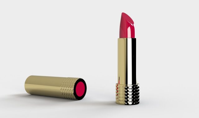
In beauty, packaging is part of the product experience before the formula reaches the skin, lips, or hair. The first design question should not be, “How can this look different?” It should be, “What moment should the user remember?” A cleanser may need a calm, hygienic pump. A lipstick may need a precise click, a weighted cap, and a shade cue that is visible in a drawer. A fragrance bottle may need to feel display-worthy while still being comfortable to hold and spray.
This ritual-led approach helps prevent novelty for its own sake. Odd silhouettes, oversized caps, hidden openings, and highly reflective labels can attract attention, but they can also create issues with filling lines, shipping damage, label readability, or day-to-day use. The more original the pack structure is, the more important it becomes to check how people open, hold, dose, close, clean, and store it.
Formula protection comes first
Skincare and cosmetics often contain ingredients that are sensitive to light, oxygen, heat, or contamination. A transparent jar may show color beautifully, but it may not suit every formula. A dropper may signal a serum ritual, but for some formulations an airless pump may offer better protection. Unique packaging should therefore be developed with compatibility testing, filling requirements, shelf-life needs, and transport conditions in mind.
Tactile details can create recognition
Distinctiveness does not always require a custom mold. Texture, grip, cap movement, embossing, debossing, soft-touch effects, paper grain, refill locking mechanisms, and a recognizable closure sound can all create memory. These details are especially useful in beauty because the category is highly sensory. A small, repeatable tactile cue can make a brand feel more ownable than a complicated shape that is costly to produce and difficult to recycle.
Make sustainability specific instead of decorative
Sustainability is now one of the main reasons beauty packaging is being redesigned, but it is also one of the easiest areas to overstate. NielsenIQ’s 2023 sustainable beauty research reported that 62% of consumers considered sustainability more pivotal than two years earlier, while searches for refillable options increased by 64%. Those figures indicate interest, not guaranteed purchase behavior. Consumers still need convenience, availability, product performance, and clear instructions.
A 2024 systematic review on eco-friendly beauty packaging also found that unclear definitions around terms such as green, natural, and eco-friendly can create consumer confusion. For design teams, the lesson is direct: do not use sustainability as a mood. Translate it into visible, verifiable packaging decisions.
| Design route | What makes it distinctive | Practical limitation to check |
|---|---|---|
| Refillable outer pack | Turns the primary component into a keepsake object and creates a repeat purchase ritual. | The refill must be easy to find, easy to insert, and meaningfully lighter or lower-waste than buying the full pack again. |
| Mono-material construction | Creates a clean, engineered look and can support recyclability goals. | Pumps, mirrors, magnets, labels, and coatings may still complicate recycling if they are not designed as part of the system. |
| Paper-based secondary packaging | Offers space for storytelling, embossing, texture, and lower-plastic presentation. | Coatings, foils, windows, and laminates can reduce recyclability or add unnecessary material. |
| Concentrated or solid formats | Reduces or removes the need for conventional liquid packaging and can feel highly innovative. | The formula, usage instructions, storage, and hygiene expectations must be very clear. |
| Take-back or specialty recycling | Gives small beauty components a defined end-of-use pathway. | Participation depends on consumer effort, store access, cleaning requirements, and transparent reporting. |
Pact Collective has emphasized that much beauty and wellness packaging is difficult for curbside recycling because it can be too small, too flexible, made from mixed materials, or unsupported by end markets. This is especially relevant for compacts, pumps, droppers, caps, mascara components, sample sachets, and decorated miniatures. A unique pack that cannot be separated, cleaned, reused, or recycled may still succeed visually, but its sustainability story will be weak.
Use visual codes that stand apart and still read clearly
Beauty packaging has to work in several environments at once: retail shelves, e-commerce thumbnails, bathroom counters, handbags, unboxing videos, and disposal moments. A distinctive visual identity must hold up across all of those settings. High-contrast typography, consistent shade naming, visible product type, and an obvious opening point matter as much as color trends or decorative finishes.
One useful approach is to separate brand recognition from product navigation. Brand recognition can come from a recurring shape language, cap profile, label proportion, material contrast, or repeated symbol. Product navigation should remain straightforward. A shopper should not have to decode a complex design story to understand cleanser versus serum, day versus night, shade family, skin type, or fragrance concentration.
- Color systems: Use color to organize ranges, not just to follow trends. Muted palettes can suggest clinical skincare, while bolder contrasts may suit color cosmetics, but legibility should remain the test.
- Typography: Expressive type can build personality, but required information and product instructions need enough size, spacing, and contrast.
- Shape: Structural uniqueness should support grip, dispensing, refill, or storage. If a shape only looks different, it may not justify higher tooling or shipping complexity.
- Finish: Metallic effects, gradients, varnishes, and tactile coatings can be memorable, but they should be assessed for scuffing, recyclability, and consistency across production runs.
- Accessibility: Clear labels, tactile cues, easy-open closures, and visible shade indicators can make a package more useful to more people.
The most durable visual systems are flexible. They allow seasonal editions, new shades, and new product formats without forcing the brand to redesign everything from zero.
Design claims and labeling into the concept early
Packaging design is also a compliance surface. In the United States, FDA cosmetic labeling rules require key information such as product identity and net quantity on the principal display panel, with ingredient declarations required for cosmetics sold to consumers in retail contexts. This does not mean every beauty pack has to look clinical, but it does mean the design must reserve space for mandatory information from the beginning.
Environmental claims require the same discipline. The FTC Green Guides state that marketers should qualify recyclable claims when recycling facilities are not available to at least 60% of consumers or communities where the product is sold. They also require competent and reliable evidence for claims such as compostable, degradable, recycled content, or source reduction. In practice, phrases such as “eco-friendly,” “planet-safe,” or “green packaging” are weaker than precise statements about material, recycled content, refill weight, disposal instructions, or third-party certification. See also: BEAUTY INGREDIENTS.
For brands selling into Europe, the regulatory direction is becoming more specific. The European Commission has stated that the Packaging and Packaging Waste Regulation entered into force in February 2025, began applying on a phased basis from 12 August 2026, and includes measures such as a harmonised packaging labelling system from 2028 and recyclability requirements from 2030. Design teams do not need to turn every concept into a legal document, but they should involve regulatory, sourcing, and sustainability specialists before approving expensive molds, decorations, or claims.
A practical framework for evaluating a concept
A beauty pack can be distinctive and still fail if it is too costly to scale, too fragile to ship, too confusing to use, or too vague in its claims. Before committing to a final design, teams can score each concept against a simple decision framework.
| Evaluation area | Question to ask | Red flag |
|---|---|---|
| Recognition | Can a shopper identify the brand or range in three seconds? | The pack depends on tiny details that disappear in thumbnails or on a crowded shelf. |
| Use experience | Does the closure, pump, applicator, or refill action feel intuitive? | The design needs too many instructions for a basic action. |
| Formula fit | Does the material protect the formula throughout its intended shelf life? | The visual idea was approved before compatibility or stability checks. |
| Material logic | Can the main components be reused, recycled, separated, or reduced? | The design adds mixed materials only for decoration. |
| Claim support | Can every sustainability or performance claim be documented? | The label uses broad words without proof or clear scope. |
| Operational reality | Can suppliers fill, decorate, pack, ship, and replace components reliably? | The concept requires fragile or rare components with no backup plan. |
This framework also helps smaller beauty brands avoid copying luxury cues without understanding the trade-offs. Heavy glass, magnetic closures, metallized effects, and complex secondary cartons can feel premium, but they may increase cost, weight, breakage risk, or end-of-life complexity. Conversely, a lightweight tube, aluminum component, molded pulp insert, or refill pouch can feel premium if the proportions, typography, color, and tactile details are carefully resolved.
Where unique beauty packaging is heading
The next stage of beauty packaging is likely to reward designs that are distinctive by behavior, not only by appearance. Refillable lip products, concentrated haircare, mono-material mechanisms, easy-to-sort labels, and more accessible closures all show that originality can come from how a package is used and reused. Mintel has noted that refillable beauty launches in the United States grew only modestly between 2022 and 2024, which suggests that refill systems still face cost, logistics, and habit barriers. That does not make refills irrelevant; it makes design execution more important.
For editors, designers, and brand teams, the key point is balance. The strongest beauty packs create an immediate visual and tactile signature, protect the product, give consumers enough information to act confidently, and avoid sustainability language that cannot be substantiated. A pack does not have to be loud to be unique. It has to be recognizable, useful, credible, and consistent with the product promise.
Frequently asked questions
What makes packaging design unique in the beauty industry?
Beauty packaging feels unique when it combines a recognizable brand system with a meaningful product experience. This can come from shape, color, material, texture, dispensing, refill behavior, or the way information is organized. The design should still protect the formula and remain easy to understand.
Are refillable beauty packages always more sustainable?
Not automatically. A refillable system needs repeat use, accessible refills, lower material impact per refill, and clear consumer instructions. If customers do not buy refills or if the refill uses nearly as much material as the original pack, the sustainability benefit may be limited.
How can a small beauty brand create distinctive packaging on a limited budget?
Small brands can focus on label architecture, color coding, paper texture, cap choice, tactile details, clear naming, and a consistent visual grid instead of expensive custom molds. A disciplined system often looks more professional than a costly one-off shape.
What should brands avoid when making sustainability claims on packaging?
Brands should avoid broad claims such as “green,” “eco-safe,” or “fully recyclable” unless they can define the claim and support it with evidence. More useful claims specify the material, recycled content, refill format, or disposal pathway and make clear whether the claim applies to the product, package, or a component.
Source note: This article refers to public information from the U.S. FDA, the FTC Green Guides, the European Commission, NielsenIQ, Mintel, Grand View Research, Pact Collective, the Ellen MacArthur Foundation, and recent packaging research literature.